I'm having a little problem with funds and box-shadows.
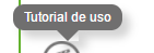
As you can see in the image, the triangle (made with CSS) has as an edge that lets see that gap, breaking the shadows of the box-shadow of both elements.
The code is as follows:
/* Generated by less 2.5.1 */
* {
  margin: 0;
  padding: 0;
  box-sizing: border-box;
}
/* Demo of the tool-tip CSS */
.tooltip {
  text-decoration: underline;
  color: #37b9b5;
  cursor: default;
}
.tooltip-bubble {
  position: absolute;
  z-index: 1;
  padding: 5px 10px;
  color: #fff;
  width: auto;
  box-shadow: 7px 7px 11px 0px rgba(112, 111, 111, 0.3);
  background-color: transparent;
  border-radius: 10px;
}
.tooltip-bubble div {
  position: relative;
  z-index: 1;
  font-size: 12px;
}
.tooltip-bubble::before {
  position: absolute;
  content: '';
  top: 0;
  left: 0;
  width: 100%;
  height: 100%;
  background-color: #706f6f;
  border-radius: 10px;
}
.tooltip-bubble .arrow {
  content: '';
  display: block;
  position: absolute;
  top: 100%;
  left: 50%;
  width: 0px;
  height: 0px;
  border-left: 10px solid transparent;
  border-right: 10px solid transparent;
  transform: translate(-50%, 0);
  box-shadow: 7px 7px 11px 0px rgba(112, 111, 111, 0.3);
}
.tooltip-bubble .arrow.up {
  top: -10px;
  border-bottom: 10px solid #706f6f;
  border-left: 10px solid transparent;
  border-right: 10px solid transparent;
}
.tooltip-bubble .arrow.down {
  border-top: 10px solid #706f6f;
  border-left: 10px solid transparent;
  border-right: 10px solid transparent;
}
<div class="tooltip-bubble"><div>Tutorial de uso</div><div class="arrow down"></div></div>I've tried transparent backgrounds in the arrow class, but there's no way to get it.
If there is any way to solve this problem, I would love to know for future projects that may arise.