Scrolling effect in a column

2

I am programming a web page with Bootstrap and on one of the pages I have a two-column structure. On the right I have an image or several and on the left a text that is the description of the image. What I want to achieve is that when I scroll down to see the complete image or all the images, the text accompanies me.

I tried to use position: fixed in the text or the affix attribute but it does not work since the text accompanies me but it does not look whole because it gets under the image.

The page can be found here:

link

If necessary, I copy the css or the html code.

Any idea why this can happen or if there is some other way to solve it?

Code:

<section class="row2 text-center col-md-12 center-block text-center">
  <div class="col-sm-2 col-md-2">
    <div class="projectext">
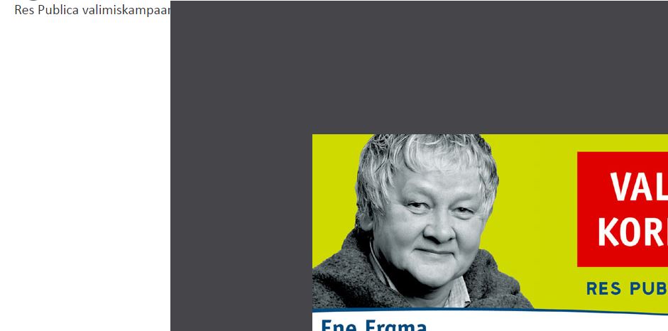
      <p class="">Res Publica valimiskampaania graafilise stiili kujundus välireklaamidele ja trükistele.</p>
    </div>
  </div>

  <div class="col-sm-10 col-md-10">
    <div class="image">
      <img src="images/Res Publica valimiskampaania kujundus.jpg" class="img-responsive pull-left" alt="web design app image";>
    </div>
  </div>
  </div>

</section>

CSS:

.projectext{

position: fixed;
overflow:hidden;

}

Thank you very much!

    
asked by Sabrina 27.06.2016 в 11:39
source

2 answers

2

Remove position: fixed; and it will no longer be placed on you.

When you use fixed it does not take into account the position of anything, but it is placed by default in the 0.0 of its available space.

If you want to use fixed for the text to follow you with the page keep it that way but add a margin-left in all your images (add it in a css class for the images).

In particular, you could:

.projectext{
    position: fixed;
    overflow:hidden;
    width: 200px;
}
    
answered by 28.06.2016 / 12:51
source
0

When you work with boostrap it is assumed that the images must be responsive so that it adapts to the resolution of the device

Bootstrap Images

as you will see in the article the definition of class="img-responsive"

<img src="kites.jpg" class="img-responsive" alt="Flying Kites">

this will make the image adapt.

Regarding the text, evaluate the comments here

More HTML & CSS: Images with Bootstrap

You will see that you can apply the class="pull-right" style to adapt it to the image

<img src="..." alt="..." class="pull-right">
    
answered by 27.06.2016 в 15:03