This is a (adapted) translation of the accepted answer for a similar question on the site in English. If this answer is useful, accept it and visit the original answer to give it a positive vote.
"shrink-to-fit=no" is something specific to Safari, at least at the time of writing this response, and was introduced as part of Safari 9.0. Quoting the section "What's new in Safari?" of the documentation for Safari 9.0 :
Changes in the Viewport
Viewport meta tags that use "width=device-width" will cause the page to scale (down) to fit content that sticks out of the viewport boundaries. You can override this behavior by adding "shrink-to-fit=no" to your meta tag as shown below. The added value will prevent the page from scaling to fit the viewport.
<meta name="viewport" content="width=device-width, initial-scale=1.0, shrink-to-fit=no">
In short, adding that to the meta tag (or meta-tag) of the viewport will restore the behavior of versions prior to Safari 9.0.
Example
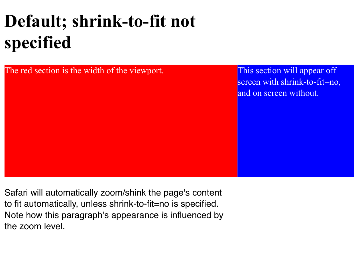
Here is a visual example that shows the difference after loading the page with both configurations.
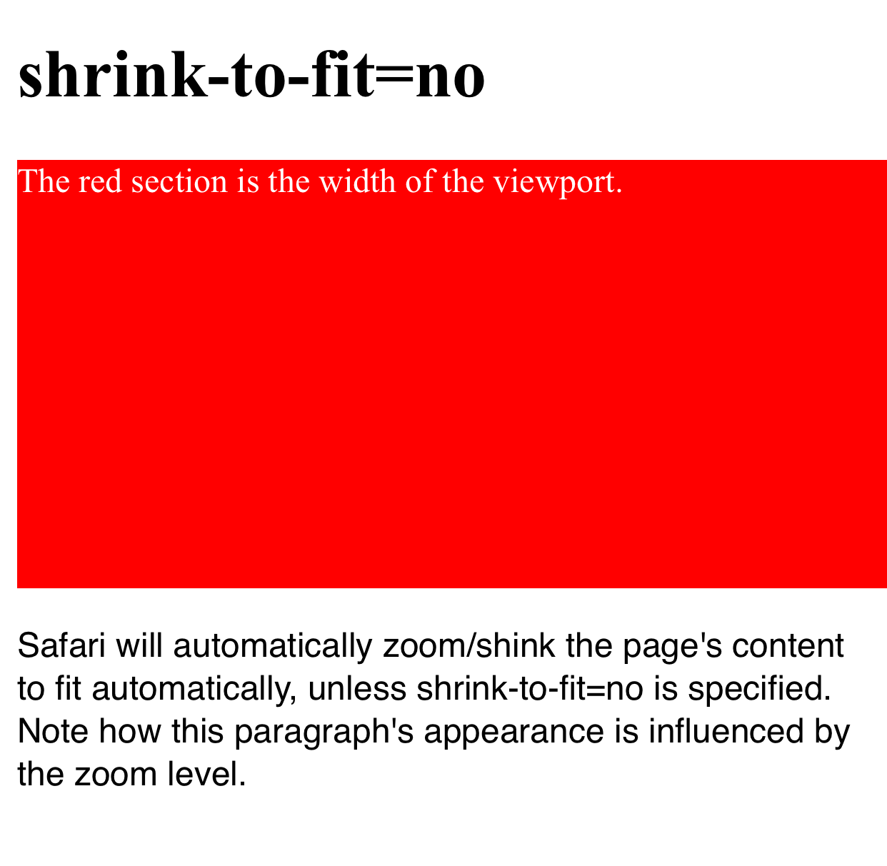
The section in red is the width of the viewport and the blue section is positioned outside the initial viewport (e.g. left: 100vw ). You can see how in the first example the page has zoom to adjust when shrink-to-fit=no is omitted (therefore showing the content that is outside the viewport), and the blue area is kept off the screen in the second example.
The code in this example can be found in this Codepen .
Not specified shrink-to-fit
With shrink-to-fit=no