I need to get with bootstrap 4 rehubicar the div, so it does not leave a gap. I do not know if I explain myself. I think that with the images is better explained what I want.
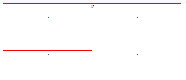
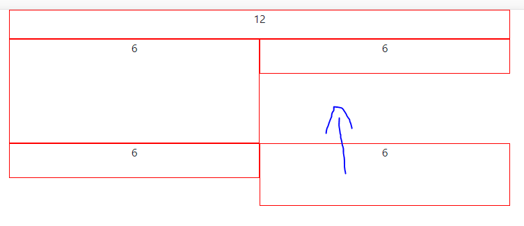
I know that with bootstrap 3, this happened automatically and you had to fix "the problem" with .clearfix, which left the gap, but I need the opposite.
The code I have is simple:
<!doctype html>
<html lang="en">
  <head>
    <!-- Required meta tags -->
    <meta charset="utf-8">
    <meta name="viewport" content="width=device-width, initial-scale=1, shrink-to-fit=no">

    <!-- Bootstrap CSS -->
    <link rel="stylesheet" href="https://stackpath.bootstrapcdn.com/bootstrap/4.1.3/css/bootstrap.min.css" integrity="sha384-MCw98/SFnGE8fJT3GXwEOngsV7Zt27NXFoaoApmYm81iuXoPkFOJwJ8ERdknLPMO" crossorigin="anonymous">

    <title>Hello, world!</title>
  </head>
  <body>
    <div class="container">
      <div class="row clearfix">
        <div style="border: 1px solid red;" class="col-12"><p  class="text-center">12</p></div>
        <div style="border: 1px solid red; height: 150px;" class="col-6"> <p  class="text-center">6</p></div>
        <div style="border: 1px solid red; height: 50px;" class="col-6"> <p  class="text-center">6</p></div>
        <div style="border: 1px solid red; height: 50px" class="col-6 "> <p  class="text-center">6</p></div>
        <div style="border: 1px solid red; height: 90px " class="col-6 "> <p  class="text-center">6</p></div>
      </div>
    </div>

    <!-- Optional JavaScript -->
    <!-- jQuery first, then Popper.js, then Bootstrap JS -->
    <script src="https://code.jquery.com/jquery-3.3.1.slim.min.js" integrity="sha384-q8i/X+965DzO0rT7abK41JStQIAqVgRVzpbzo5smXKp4YfRvH+8abtTE1Pi6jizo" crossorigin="anonymous"></script>
    <script src="https://cdnjs.cloudflare.com/ajax/libs/popper.js/1.14.3/umd/popper.min.js" integrity="sha384-ZMP7rVo3mIykV+2+9J3UJ46jBk0WLaUAdn689aCwoqbBJiSnjAK/l8WvCWPIPm49" crossorigin="anonymous"></script>
    <script src="https://stackpath.bootstrapcdn.com/bootstrap/4.1.3/js/bootstrap.min.js" integrity="sha384-ChfqqxuZUCnJSK3+MXmPNIyE6ZbWh2IMqE241rYiqJxyMiZ6OW/JmZQ5stwEULTy" crossorigin="anonymous"></script>
  </body>
</html>
Let's see if you can help me. Thanks