I invite you to study a little more about the html form elements and explore each of the different types and their uses.
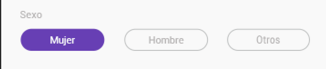
Although there is no option that automatically allows you to give the style you want, natively, if there are ways to simulate them, for example the item you are looking for is the input of "radio buttons" or radio in English. These allow you to associate a question with multiple answers, where there can only be a single answer unlike the type "check" that allows you to select more than one answer.
<h5>Inputs radio</h5>

<input name="asociacion" type="radio">
<input name="asociacion" type="radio">
<input name="asociacion" type="radio">
<input name="asociacion" type="radio">

<h5>Inputs Checkbox</h5>

<input name="asociacion" type="checkbox">
<input name="asociacion" type="checkbox">
<input name="asociacion" type="checkbox">
<input name="asociacion" type="checkbox">
The relationship and / or grouping between the different inputs , is done using the "name" attribute as you can see in the previous example.
Once this is understood, you should understand that there is a direct relationship between the label elements and the inputs, these are correlated using the for attribute in the case of the label and the attribute id for the inputs .
label{
  background: whitesmoke;
  padding: 0.5em 1em;
  cursor: pointer;
}

label:hover{
  background: gray;
  color: white;
}
<form>

<h5>Inputs radio</h5>

<input name="asociacion" type="radio" id="input_1">
<input name="asociacion" type="radio" id="input_2">
<input name="asociacion" type="radio" id="input_3">

</form>
<br><br>
<div>
  <label for="input_1">Input 1</label>
  <label for="input_2">Input 2</label>
  <label for="input_3">Input 3</label>
</div>
Already the rest would be the magic of css, for this, hide the radio inputs and only make the label visible . As you see it does not matter if the inputs or labels are not side by side, they can be separated or even nested, they will remain related. Now if we want the label style to look as if we had checked them (as in the image you share), the order is important, since the only way to relate them via CSS is to fulfill the following conditions:
The inputs and labels can not be nested in different html elements.
The inputs should not be nested, above the whole structure.
If the labels are consistent with the inputs, we can use the following syntax:
#input_1:checked ~ label[for="input_1"]{
  /*Estilos...*/
}
If the labels are nested in an html element, you have to relate the parent and then the labels, something like this:
#input_1:checked ~ .padre_ancestro label[for="input_1"]{
  /*Estilos...*/
}
An example all together would be, something like this:
.pregunta{
  padding: 1em;
}

input.esconder{
  position: fixed;
  opacity: 0;
}

/*Esto es para crear una excepción en el label que tenga la clase group*/
/*Podría haber colocado los estilos del 3er ejemplo aquí, pero para que no te confundas, los separe más abajo*/
label:not(.grupo){
  background: whitesmoke;
  padding: 0.5em 1em;
  cursor: pointer;
  border-radius: 3em;
}

label:not(.grupo):hover{
  background: gray;
  color: white;
}

/*Estilos para estructura 1*/
#input_1:checked ~ div label[for="input_1"],
#input_2:checked ~ div label[for="input_2"],
#input_3:checked ~ div label[for="input_3"],
/*Estilos para estructura 2*/
#input_4:checked + label[for="input_4"],
#input_5:checked + label[for="input_5"]{
  background: black;
  color: white;
}

/*Estilos para estructura 3*/
label.grupo span{
  display: inline-button;
  background: whitesmoke;
  padding: 0.5em 1em;
  cursor: pointer;
  border-radius: 3em;
}

label.grupo:hover span{
  background: gray;
  color: white;
}

#input_6:checked + span,
#input_7:checked + span{
  background: black;
  color: white;
}
<form>

    <fieldset class="pregunta uno">

    <legend>Estructura 1</legend>

      <input name="asociacion" type="radio" id="input_1" class="esconder">
      <input name="asociacion" type="radio" id="input_2" class="esconder">
      <input name="asociacion" type="radio" id="input_3" class="esconder">

      <div>
        <label for="input_1">Input 1</label>
        <label for="input_2">Input 2</label>
        <label for="input_3">Input 3</label>
      </div>

    </fieldset>
    <fieldset class="pregunta dos">

    <legend>Estructura 2</legend>

      <input name="asociacion" type="radio" id="input_4" class="esconder">
      <label for="input_4">Input 4</label>

      <input name="asociacion" type="radio" id="input_5" class="esconder">
      <label for="input_5">Input 5</label>

    </fieldset>
    <fieldset class="pregunta tres">

    <!--Esta 3ra estructura es para anidar o agrupar tanto el label como el input, en este caso el estilo que simula ser un botón se lo aplicamos al <span> que contendrá el <label> y que deberá estar consiguiente del <input type="radio">-->

    <legend>Estructura 3</legend>

    <label for="input_6" class="grupo">
      <input name="asociacion" type="radio" id="input_6" class="esconder">
      <span>Input 6</span>
    </label>

    <label for="input_7" class="grupo">
      <input name="asociacion" type="radio" id="input_7" class="esconder">
      <span>Input 7</span>
    </label>

    </fieldset>

</form>
If you have another question, leave me your comment. Successes!