Overlaid images responsive Possibilities?

2

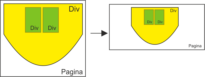
I'm playing with the positioning of responsive images (using our bootstrap friend) and I want to make a base image, like the one in the example in which I have a div with a background image and on this several div with images (with transparency).

All this responsive and always positioned on the main div, I put a photo of the intention:

Now well:

  • Can you make the background of a responsive div?
  • How do I position one image on top of another? I mean, if I wanted to put one letter on top of the other right now, how would it be possible respecting the previous requirements?

Thank you very much.

#color{
	background-image: url("https://preview.ibb.co/dmmFJK/Tablero1080.png");
	
    -webkit-background-size: cover;
    -moz-background-size: cover;
    -o-background-size: cover;
    background-size: cover;
	   /* background:no-repeat fixed center;  */
	width:100%;
	height:100%;
	max-width:1080px;
	max-height:660px;
	margin-top:30px;


}
<!doctype html>
<html lang="en">
  <head>
    <!-- Required meta tags -->
    <meta charset="utf-8">
    <meta name="viewport" content="width=device-width, initial-scale=1, shrink-to-fit=no">

    <!-- Bootstrap CSS -->
    <link rel="stylesheet" href="https://stackpath.bootstrapcdn.com/bootstrap/4.1.3/css/bootstrap.min.css" integrity="sha384-MCw98/SFnGE8fJT3GXwEOngsV7Zt27NXFoaoApmYm81iuXoPkFOJwJ8ERdknLPMO" crossorigin="anonymous">

    <title>Bj</title>
  </head>
  <body>
		<!-- The Modal -->
		<div class="container" id="color">

		  <div class="row justify-content-center">
			<div class="col-4" id="color2">
			  1 of two columns
			  <img src="https://image.ibb.co/mr7cXe/AS_co.png" class="img-fluid" alt="Responsive image">
			</div>
			<div class="col-4" id="color1">
			  2 of two columns
			  <img src="https://image.ibb.co/mr7cXe/AS_co.png" class="img-fluid" alt="Responsive image">
			</div>
		  </div>
		  
		  
		</div>
    <!-- Optional JavaScript -->
    <!-- jQuery first, then Popper.js, then Bootstrap JS -->
    <script src="https://code.jquery.com/jquery-3.3.1.slim.min.js" integrity="sha384-q8i/X+965DzO0rT7abK41JStQIAqVgRVzpbzo5smXKp4YfRvH+8abtTE1Pi6jizo" crossorigin="anonymous"></script>
    <script src="https://cdnjs.cloudflare.com/ajax/libs/popper.js/1.14.3/umd/popper.min.js" integrity="sha384-ZMP7rVo3mIykV+2+9J3UJ46jBk0WLaUAdn689aCwoqbBJiSnjAK/l8WvCWPIPm49" crossorigin="anonymous"></script>
    <script src="https://stackpath.bootstrapcdn.com/bootstrap/4.1.3/js/bootstrap.min.js" integrity="sha384-ChfqqxuZUCnJSK3+MXmPNIyE6ZbWh2IMqE241rYiqJxyMiZ6OW/JmZQ5stwEULTy" crossorigin="anonymous"></script>
  </body>
</html>
    
asked by Roarca 21.08.2018 в 13:27
source

1 answer

0

I do not know if I understood what you want but I prepared an example that may help you.

First, the HTML that contains:

  • A Div Container.
  • A second Div that will contain the cards.
  • 2 divs that the cards represent.
  • 3 <button> elements that will be outside the container.

    <div class="container">
        <div id="main-div">
        <div class="card position-card1" id="card1">card 1</div>
        <div class="card position-card2" id="card2">card 2</div>
    </div>
    
    <div id="botones">
        <button id="btn1">card 2 over card 1</button>
        <button id="reset">reset</button>
        <button id="btn2">card 1 over card 2</button>
    </div>
    

Now a bit of CSS:

In the container Div, I give you a display: flex to solve your question of making it responsive.

.container{
   display: flex;
   justify-content: center;   
}

The #main-div is the container of the 2 cards, therefore I give positión: relative to be able to place the cards within it.

#main-div{
    position: relative;
    min-width: 300px;
    height: 200px;
    background: rgb(255,240,0);
    border: 4px solid rgb(255,200,0);
}

Now we give the cards styles. Both will have a position: absolute to be able to play with the coordinates. The rest is makeup.

.card{
    position: absolute;
    width: 60px;
    height: 100px;
    background: rgb(0,255,0);
    border: 2px solid rgb(0,200,100);
    text-align: center;
    line-height: 100px;
}

Each card is proportionally positioned in its parent container. (Remember that they have position: absolute and focus vertically.

.position-card1{
    top: 50px;
    left: 60px;
    z-index: 1;
}

.position-card2{
    top: 50px;
    left: 180px;
    z-index: 1;
}

Now to be able to superimpose one card on top of the other, I create 3 buttons to launch the events with javascript, a button to overlay the card2 on card1 other to trigger the opposite effect. and finally a reset button to reset the positions.

.over-card2{
    top: 46px;
    left: 176px;
    z-index: 100;
}

.over-card1{
    top: 46px;
    left: 56px;
    z-index: 100;
}

#botones{
    display: flex;
    justify-content: center;  
}

#reset,
#btn1{
    margin-right: 15px;
}

Finally, the Javascript code:

I retrieve the elements of the sun (the 3 buttons) in 3 variables:

var btn1 = document.getElementById('btn1');
var btn2 = document.getElementById('btn2');
var reset = document.getElementById('reset');

I program the buttons:

btn1.addEventListener('click', function(){
    let card2 = document.getElementById('card2');
    card2.classList.replace('position-card2','over-card1');
});

btn2.addEventListener('click', function(){
    let card1 = document.getElementById('card1');
    card1.classList.replace('position-card1','over-card2');
});

* The class over is added so that it always overlaps with z-index *

And finally the button that restores the cards to the initial position.

reset.addEventListener('click', function(){
    let reset = document.getElementById('reset');
    card1.className = 'card position-card1';
    card2.className = 'card position-card2';
});

I enclose the code already complete and also, You can Test the effect here below. I hope it will help you or at least give you ideas to improve it and very surely with JQuery come out with less lines. Blessings!

var btn1 = document.getElementById('btn1');
var btn2 = document.getElementById('btn2');
var reset = document.getElementById('reset');

btn1.addEventListener('click', function(){
  let card2 = document.getElementById('card2');
  card2.classList.replace('position-card2','over-card1');
});

btn2.addEventListener('click', function(){
  let card1 = document.getElementById('card1');
  card1.classList.replace('position-card1','over-card2');
});

reset.addEventListener('click', function(){
  let reset = document.getElementById('reset');
  card1.className = 'card position-card1';
  card2.className = 'card position-card2';
});
.container{
    display: flex;
    justify-content: center;   
}

#main-div{
  position: relative;
  min-width: 300px;
  height: 200px;
  background: rgb(255,240,0);
  border: 4px solid rgb(255,200,0);
}

.card{
  position: absolute;
  width: 60px;
  height: 100px;
  background: rgb(0,255,0);
  border: 2px solid rgb(0,200,100);
  text-align: center;
  line-height: 100px;
}

.position-card1{
  top: 50px;
  left: 60px;
  z-index: 1;
}

.position-card2{
  top: 50px;
  left: 180px;
  z-index: 1;
}

.over-card2{
  top: 46px;
  left: 176px;
  z-index: 100;
}

.over-card1{
  top: 46px;
  left: 56px;
  z-index: 100;
}

#botones{
  display: flex;
  justify-content: center;  
}

#reset,
#btn1{
  margin-right: 15px;
}
<div class="container">
  <div id="main-div">
      <div class="card position-card1" id="card1">card 1</div>
      <div class="card position-card2" id="card2">card 2</div>
  </div>  
</div>

<div id="botones">
  <button id="btn1">card 2 over card 1</button>
  <button id="reset">reset</button>
  <button id="btn2">card 1 over card 2</button>
</div>
    
answered by 22.08.2018 / 05:28
source