Overlay opacity html css

4

I am developing a web page where I want to put a background image with an opacity of 0.3 and that the letters above do not suffer from opacity. The letters would be nested inside the div of the image. I do not know how to do it or if you can, what do you recommend?

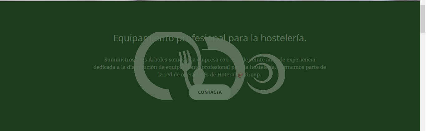
This is how the website looks:

Here we would have the html code:

<section class="bg-primary" id="nosotros">
<div class="barnner1" id="nosotros1">        
    <div class="container">
        <div class="row">
            <div class="col-lg-8 col-lg-offset-2 text-center">
                <h2 class="section-heading">Equipamiento profesional para la hostelería.</h2>
                <hr class="light">
                <p class="text-faded">Suministros Tres Árboles somos una empresa con más de veinte años de experiencia dedicada a la distribución de equipamiento profesional para la hostelería. Formamos parte de la red de operadores de Hoterali<font color="red">@</font> Group.</p>
                <a href="#contacto" class="page-scroll btn btn-default btn-xl sr-button">Contacta</a>
            </div>
        </div>
    </div>
</div>
</section>

This would be barnner (where I put the image):

.barnner1{
background-image: url("logogris.png"); 
background-repeat: no-repeat;
background-position: center;
opacity: 0.3

}

And finally we have bg.primary where the background color is indicated:

.bgprimary { background-color: #3A6324; }

Thanks for your help

    
asked by CMorillo 28.07.2017 в 10:34
source

3 answers

4

The problem is that when you give opacity to an element all its content will have at least that opacity, you can have more but never less.

You can use the pseudo-element ::after or ::before and put there the image and the opacity you need:

.bg-primary {
  background-color: #3A6324;
  z-index: -2;
  position: relative;
}

.barnner1 {
  position: relative;
}

.barnner1::after {
  content: "";
  display: block;
  position: absolute;
  left: 0;
  top: 0;
  width: 100%;
  height: 100%;
  background-image: url("http://lorempixel.com/400/200/sports/1/");
  background-repeat: no-repeat;
  background-position: center;
  opacity: 0.3;
  z-index: -1;
}
<section class="bg-primary" id="nosotros">
  <div class="barnner1" id="nosotros1">
    <div class="container">
      <div class="row">
        <div class="col-lg-8 col-lg-offset-2 text-center">
          <h2 class="section-heading">Equipamiento profesional para la hostelería.</h2>
          <hr class="light">
          <p class="text-faded">Suministros Tres Árboles somos una empresa con más de veinte años de experiencia dedicada a la distribución de equipamiento profesional para la hostelería. Formamos parte de la red de operadores de Hoterali
            <font color="red">@</font> Group.</p>
          <a href="#contacto" class="page-scroll btn btn-default btn-xl sr-button">Contacta</a>
        </div>
      </div>
    </div>
  </div>
</section>

UPDATE

I have edited my answer to put the image below the text but above the background color as suggested by @aldanux.

The elements with position:static (the default position) do not accept the property z-index so for the div.bg-primary to be below .barnner1::after I have added also position:relative

    
answered by 28.07.2017 / 11:16
source
3

The answers given do not convince me because the image is on the text ... here I leave an example with the image behind the text:

div {
    position: relative;
    font-weight: bold;    
}

div:before {
    display: block;
    content: '';
    width: 50%;
    height: 100%;
    background: url("http://lorempixel.com/output/people-q-c-640-480-9.jpg") center no-repeat;
    opacity: .5;
    position: absolute; 
    left: 0;
    right: 0;
    margin: auto;
    z-index: -1; /* Ponemos debajo del text */
}

div:after {
   display: block;
    content: '';
    width: 100%;
    height: 100%;
    background-color: rgba(71, 122, 52, .4);
    position: absolute; 
    top: 0;
    z-index: -2;  /* Ponemos debajo del imagen y text */
}
<div>Lorem Ipsum es simplemente el texto de relleno de las imprentas y archivos de texto. Lorem Ipsum ha sido el texto de relleno estándar de las industrias desde el año 1500, cuando un impresor (N. del T. persona que se dedica a la imprenta) desconocido usó una galería de textos y los mezcló de tal manera que logró hacer un libro de textos especimen. No sólo sobrevivió 500 años, sino que tambien ingresó como texto de relleno en documentos electrónicos, quedando esencialmente igual al original. Fue popularizado en los 60s con la creación de las hojas "Letraset", las cuales contenian pasajes de Lorem Ipsum, y más recientemente con software de autoedición, como por ejemplo Aldus PageMaker, el cual incluye versiones de Lorem Ipsum.</div>

Edit: With your given example it would be something like this:

.bg-primary {
    position: relative;
    font-weight: bold;    
}

.bg-primary:before {
    display: block;
    content: '';
    width: 50%;
    height: 100%;
    background: url("http://lorempixel.com/output/people-q-c-640-480-9.jpg") center no-repeat;
    opacity: .5;
    position: absolute; 
    left: 0;
    right: 0;
    margin: auto;
    z-index: -1; /* Ponemos debajo del text */
}

.bg-primary:after {
   display: block;
    content: '';
    width: 100%;
    height: 100%;
    background-color: rgba(71, 122, 52, .4);
    position: absolute; 
    top: 0;
    z-index: -2;  /* Ponemos debajo del imagen y text */
}
<section class="bg-primary" id="nosotros">
<div class="barnner1" id="nosotros1">        
    <div class="container">
        <div class="row">
            <div class="col-lg-8 col-lg-offset-2 text-center">
                <h2 class="section-heading">Equipamiento profesional para la hostelería.</h2>
                <hr class="light">
                <p class="text-faded">Suministros Tres Árboles somos una empresa con más de veinte años de experiencia dedicada a la distribución de equipamiento profesional para la hostelería. Formamos parte de la red de operadores de Hoterali<font color="red">@</font> Group.</p>
                <a href="#contacto" class="page-scroll btn btn-default btn-xl sr-button">Contacta</a>
            </div>
        </div>
    </div>
</div>
</section>
    
answered by 28.07.2017 в 12:09
1

I offer you an alternative possibility: instead of putting the solid background color, and then the translucent image on top, you can put the solid background image, and a translucent shadow on top. Something like the following example. This has the advantage of being less code (a single line) than other methods, but the effect is not exactly the same.

#container {
  width:600px;
  height:400px;
  background:url(http://lorempixel.com/600/400/);
  box-shadow:inset 0 0 0 10000px rgba(0,100,0,0.9);
  color:white;
}
<div id="container">
  Hola, este es el contenido, que no se ve afectado por el box-shadow.
</div>
    
answered by 02.08.2017 в 08:16