Center content in bootstrap

4

The content of column 2 comes out of the box in a certain width of the browser. How could I avoid this?

Image:

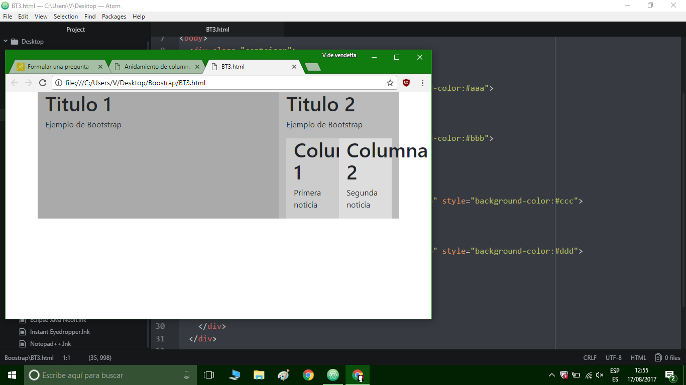
<link href="https://maxcdn.bootstrapcdn.com/bootstrap/4.0.0-beta/css/bootstrap.min.css" rel="stylesheet"/>
<!doctype html>
<html>
<head>
  <link href="css/bootstrap.min.css" rel="stylesheet">
  <meta name="viewport" content="width=device-width, initial-scale=1">
<!-- Latest compiled and minified CSS -->
</head>
<body>
  <div class="container">

    <div class="row">
      <div class="col-lg-8 col-md-8" style="background-color:#aaa">
        <h1>Titulo 1</h1>
        <p>Ejemplo de Bootstrap</p>
      </div>
      <div class="col-lg-4 col-md-4" style="background-color:#bbb">
        <h1>Titulo 2</h1>
        <p>Ejemplo de Bootstrap</p>
        <div class="container">
        <div class="row">
          <div class="col-lg-6 col-md-6 col-sm-6 col-6" style="background-color:#ccc">
            <h1>Columna 1</h1>
            <p>Primera noticia</p>
          </div>
          <div class="col-lg-6 col-md-6 col-sm-6 col-6" style="background-color:#ddd">
            <h1>Columna 2</h1>
            <p>Segunda noticia</p>
          </div>
        </div>
      </div>
    </div>
  </div>

  </div>
</body>
</html>
    
asked by Vendetta 17.08.2017 в 12:50
source

1 answer

7

All you need to do is hide what sticks out of a small cell with overflow: hidden .

The style ( div.row div ) is applied to children <div> whose parents are <div class="row"> .

You can also use the styles overflow-wrap or word-wrap to improve the final result.

div.row div {
  overflow-wrap: break-word;
  overflow: hidden;
}
<link rel="stylesheet" href="https://maxcdn.bootstrapcdn.com/bootstrap/3.3.7/css/bootstrap.min.css" integrity="sha384-BVYiiSIFeK1dGmJRAkycuHAHRg32OmUcww7on3RYdg4Va+PmSTsz/K68vbdEjh4u" crossorigin="anonymous">
<div class="container">
  <div class="row">
    <div class="col-xs-1" style="background-color:#aaa">
      <h1>Titulo 1</h1>
      <p><img src="https://upload.wikimedia.org/wikipedia/commons/b/bc/House_image_icon.png" /></p>
      <p>Ejemplo de Bootstrap</p>
    </div>
    <div class="col-xs-1" style="background-color:#bbb">
      <h1>Titulo 2</h1>
      <p>Ejemplo de Bootstrap</p>
    </div>
  </div>
</div>

In the following example I show that the use of only overflow-wrap or word-wrap is insufficient:

div.row div {
  word-wrap: break-word;
}
<link rel="stylesheet" href="https://maxcdn.bootstrapcdn.com/bootstrap/3.3.7/css/bootstrap.min.css" integrity="sha384-BVYiiSIFeK1dGmJRAkycuHAHRg32OmUcww7on3RYdg4Va+PmSTsz/K68vbdEjh4u" crossorigin="anonymous">
<div class="container">
  <div class="row">
    <div class="col-xs-1" style="background-color:#aaa">
      <h1>Titulo 1</h1>
      <p><img src="https://upload.wikimedia.org/wikipedia/commons/b/bc/House_image_icon.png" /></p>
      <p>Ejemplo de Bootstrap</p>
    </div>
    <div class="col-xs-1" style="background-color:#bbb">
      <h1>Titulo 2</h1>
      <p>Ejemplo de Bootstrap</p>
    </div>
  </div>
</div>
    
answered by 17.08.2017 / 13:18
source