Center div with CSS

1

I'm making a profile with your image as verified, but I can not get the image check to be placed next to the image of the profile, I put the parent div of the check as position:absolute but it does not work either.

.profile-banner{
  width: 100%;
  max-height: 170px;
  min-height: 170px;
  background: blue;
}


.content-profile{
  text-align: center;
}

.profile-img img{
    width: 100px;
    height: 100px;
    border-radius: 50%;
    border: 4px solid #fff;
}

.check-profile img{
    width: 20px
}
    
<div class="profile-banner">
      <div class="content-profile">
        <div class="profile-img">
        <img src="https://www.digmefitness.com/files/members/000/005/687/1490956902_1ZR6E_Blank-Avatar-Image.png" alt="">
        </div>
        <div class="check-profile">
          <div class="check-profile-position">
            <img src="http://image.prntscr.com/image/1336ad9d5388454f9b451914f4129c22.png" alt="">
          </div>
        </div>
        <div class="profile-name-ml">
          <span>User Name</span>
        </div>
      </div>
    </div>

What I want to do is have the verified image look like this example:

    
asked by Jhosselin Giménez 28.04.2017 в 02:22
source

4 answers

3

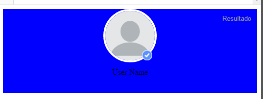
Using your markup, you must first make .check-profile an element inline-block or inline so that it does not occupy 100% of the container. Then, make it absolute and the father .content-profile make it relative so that the check takes it as reference when positioning. Finally, to be on the right edge, use calc to add 50px (half the width of the avatar) to 50% (center).

Example

.profile-banner {
  width: 100%;
  max-height: 170px;
  min-height: 170px;
  background: blue;
}

.content-profile {
  position: relative;
  text-align: center;
}

.profile-img img {
  width: 100px;
  height: 100px;
  border-radius: 50%;
  border: 4px solid #fff;
}

.check-profile {
  display: inline-block;
  position: absolute;
  left: calc(50% + 50px);
  top: 50%;
  transform: translateY(-50%);
}

.check-profile img {
  width: 20px
}

.profile-name-ml span {
  color: #fff;
}
<div class="profile-banner">
  <div class="content-profile">
    <div class="profile-img">
      <img src="https://www.digmefitness.com/files/members/000/005/687/1490956902_1ZR6E_Blank-Avatar-Image.png" alt="">
    </div>
    <div class="check-profile">
      <div class="check-profile-position">
        <img src="http://image.prntscr.com/image/1336ad9d5388454f9b451914f4129c22.png" alt="">
      </div>
    </div>
    <div class="profile-name-ml">
      <span>User Name</span>
    </div>
  </div>
</div>

Using appropriate marking is not necessary to use calc or do the absolute check. It is enough to group the avatar with the check and make them online so that they are aligned horizontally.

Example

*,
*:before,
*:after {
  box-sizing: border-box;
  margin: 0;
  padding: 0;
}

.profile-banner {
  width: 100%;
  max-height: 170px;
  min-height: 170px;
  padding: 20px;
  background: #f39c12;
}

.content-profile {
  text-align: center;
}

.profile-img {
  align-items: center;
  display: inline-flex;
}

.profile-img img {
  width: 100px;
  height: 100px;
  border-radius: 50%;
  border: 4px solid #fff;
  background-clip: padding-box;
  background-position: bottom 10px, right 10px;
}

.check-profile {
  display: inline-block;
}

.check-profile img {
  height: 25px;
  width: 25px
}

.profile-name-ml {
  padding: 10px 25px 0 0;
}

.profile-name-ml span {
  color: #fff;
}
<div class="profile-banner">
  <div class="content-profile">
    <div class="profile-img">
      <img src="https://www.digmefitness.com/files/members/000/005/687/1490956902_1ZR6E_Blank-Avatar-Image.png" alt="">
      <div class="check-profile">
        <div class="check-profile-position">
          <img src="http://image.prntscr.com/image/1336ad9d5388454f9b451914f4129c22.png" alt="">
        </div>
      </div>
    </div>
    <div class="profile-name-ml">
      <span>User Name</span>
    </div>
  </div>
</div>

There is also a third alternative, using :after to put the image as a background. For vertical centering, you make the element% co_of% absolute, you give after and top: 50% . With this the check will center vertically.

Example

.profile-banner {
  width: 100%;
  max-height: 170px;
  min-height: 170px;
  background: blue;
}

.content-profile {
  position: relative;
  text-align: center;
}

.profile-img {
  display: inline-block;
  position: relative;
}

.profile-img:after {
  background: url("http://image.prntscr.com/image/1336ad9d5388454f9b451914f4129c22.png") no-repeat;
  background-size: cover;
  content: "";
  height: 20px;
  left: 100%;
  position: absolute;
  transform: translateY(-50%);
  top: 50%;
  width: 20px;
}

.profile-img img {
  width: 100px;
  height: 100px;
  border-radius: 50%;
  border: 4px solid #fff;
}

.check-profile {
  display: inline-block;
  position: absolute;
  left: calc(50% + 50px);
  top: 50%;
  transform: translateY(-50%);
}

.check-profile img {
  width: 20px
}

.profile-name-ml span {
  color: #fff;
}
<div class="profile-banner">
  <div class="content-profile">
    <div class="profile-img">
      <img src="https://www.digmefitness.com/files/members/000/005/687/1490956902_1ZR6E_Blank-Avatar-Image.png" alt="">
    </div>
    <div class="profile-name-ml">
      <span>User Name</span>
    </div>
  </div>
</div>
    
answered by 28.04.2017 / 03:06
source
1

One option would be to apply a position relative to check and then manipulate its position with top , left .

.profile-banner{
  width: 100%;
  max-height: 170px;
  min-height: 170px;
  background: blue;
}


.content-profile{
  text-align: center;
}

.profile-img img{
    width: 100px;
    height: 100px;
    border-radius: 50%;
    border: 4px solid #fff;
}

.check-profile img{
    width: 20px;
    position: relative;
    top:-25px;
    left: 35px;
}
<div class="profile-banner">
      <div class="content-profile">
        <div class="profile-img">
        <img src="https://www.digmefitness.com/files/members/000/005/687/1490956902_1ZR6E_Blank-Avatar-Image.png" alt="">
        </div>
        <div class="check-profile">
          <div class="check-profile-position">
            <img src="http://image.prntscr.com/image/1336ad9d5388454f9b451914f4129c22.png" alt="">
          </div>
        </div>
        <div class="profile-name-ml">
          <span>User Name</span>
        </div>
 </div>
</div>

Or apply a Transformation directly:

.check-profile img{
  width: 20px;
  position: relative;    
  transform: rotate(500deg) translate(-3em) rotate(-500deg);
}
    
answered by 28.04.2017 в 02:57
1

You have to make the div check this inside the div of the profile image, you give the div the property position: relative; and to the check position: absolute; then you can now arrange the position with top, left, right or bottom

.profile-banner{
  width: 100%;
  max-height: 170px;
  min-height: 170px;
  background: blue;
}


.content-profile{
  text-align: center;
}

.profile-img img{
    width: 100px;
    height: 100px;
    border-radius: 50%;
    border: 4px solid #fff;
    
}
.profile-img{
 position:relative;
}


.check-profile img{
    width: 20px;
     height: 20px;
     position:absolute;
     bottom:0;
     right:1;

 }
<div class="profile-banner">
      <div class="content-profile">
        <div class="profile-img">
        <img src="https://www.digmefitness.com/files/members/000/005/687/1490956902_1ZR6E_Blank-Avatar-Image.png" alt="">
                <div class="check-profile">
         <div class="check-profile-position">
              <img src="http://image.prntscr.com/image/1336ad9d5388454f9b451914f4129c22.png" alt="">
          </div>
        </div>
        </div>

        <div class="profile-name-ml">
          <span>User Name</span>
        </div>
      </div>
    </div>
    
answered by 28.04.2017 в 02:34
0

I WAIT FOR YOU IT IS VERY SIMPLE BUT EFFECTIVE!

<div align="center" style="background: blue;padding:40px;">
<img  src="http://lorempixel.com/100/100/" alt="imagen" style="border-radius:100%;">
</div>
    
answered by 03.05.2017 в 21:22