Good, why do the map and the text below appear off center?
This on the computer screen does not happen to me, it happens to me when the width of the screen is less than 1200 px (approx) , ie an iPad screen for example.
How could I solve this?
h2 {
  font-size: 35px;
  text-align: center;
  padding-bottom: 40px;
}

h3 {
  text-align: center;
  margin-bottom: 20px;
}

.General {
  width: 100%;
  padding: 50px;
  box-sizing: border-box;
}

.MisDatos {
  height: auto;
  width: 75%;
  margin: 0 auto;
  text-align: center;
}

.Mapa-MisDatos {
  width: 800px;
  margin: 20px;
}

.Datos-MisDatos {
  width: 800px;
  background-color: burlywood;
  color: #FFF;
  margin: 0 auto;
  padding: 10px;
}

.Datos-MisDatos a {
  color: black;
  background-color: darkgray;
  cursor: pointer;
}

.Datos-MisDatos a:hover {
  color: white;
  background-color: dimgrey;
}
<div class="General General-MisDatos">
<div class="MisDatos">
<a name="Mis-Datos"></a>
<h2>¿Nos vemos?</h2>
<p class="Texto-MisDatos">
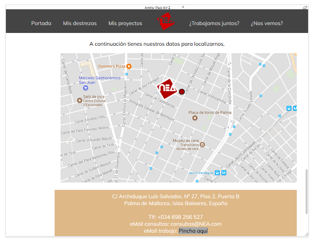
A continuación tienes nuestros datos para localizarnos.
</p>
<div class="Estructura-MisDatos">
<img src="Img/Mapa.PNG" class="Mapa-MisDatos" alt="Mapa localización empresa">
<p class="Datos-MisDatos">
C/ Archiduque Luís Salvador, Nº 27, Piso 2, Puerta B
<br> Palma de Mallorca, Islas Baleares, España
<br><br> Tlf: +034 698 256 527
<br> eMail consultas: [email protected]
<br> eMail trabajo: <a href="#Contacto"> Pincha aquí </a>
<br><br> Horario de oficina: 10:00 - 18:00
</p>
</div>
</div>
</div>