This is a " problem " that happens because you are designing for PC first and then you scale the styles to the mobiles. Then desktop styles will be applied to all resolutions unless you redefine them.
Your code is now like this:
selector {
  /* estilos que se aplicarán en todas las resoluciones */
}

@media (max-width: 768px) {
  selector {
    /* estilos que aplicarán a un máximo de 768px (móviles y tabletas) */
  }
}
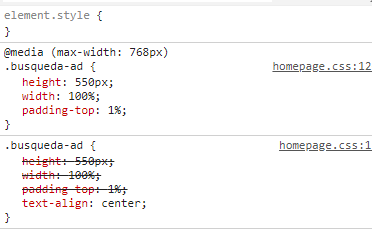
Please note that styles outside of media queries will always apply regardless of the screen resolution. The media queries will make the styles more specific and overwrite the defined properties, but if a property was defined outside of a media query and is not redefined within the media query, then the general style will prevail. That is, a style defined within a media query does not replace the general style , only complements it.
That's why you have the problem that you indicate: you are giving the red color in the main styles (which will apply to all resolutions). And that's why on your phone it looks red even if you have not put it as a style.
You have several possibilities to solve the problem:
Redefine the color to the value you want. The most general style indicates that the color is red, if you do not want this to happen on the mobile, you must redefine the color within the media query:
div {
  color: red;
  widht: 100%;
  height: 200px;
}

@media (max-width: 768px) {
  div {
    widht: 100%;
    height: 200px;
    color: black;
  }
}
In fact, since general styles are always applied, you can simplify even more your code because the width and height have the same value, leaving them like this:
div {
  color: red;
  widht: 100%;
  height: 200px;
}

@media (max-width: 768px) {
  div {
    color: black;
  }
}
Switch to a mobile-centered design first ( mobile-first design ) in which the general styles are those that apply to mobile phones and the average queries is to redefine the values in resolutions older (tablets and PCs).
selector {
  /* estilos que se aplicarán en todas las resoluciones */
}

        /* min-width en lugar de max-width */
@media (min-width: 768px) {
  selector {
    /* estilos que aplican a resoluciones mayores de 768px (tabletas y PCs) */
  }
}
In this way, the simplest styles (those of mobile) would be the general and the average queries would be for larger screen resolutions (using min-width ).
Designing for PC first or mobile first is a choice for specific for each project. Although from my experience, it is easier to start with the mobile and then climb up than to do the opposite (as you are doing). I would recommend this ... but in your case it could involve rewriting all the CSS which may not be feasible.