I want to use div to do this same training, saven of some method? or if you do not know with tables it will be then ..
I want to use div to do this same training, saven of some method? or if you do not know with tables it will be then ..
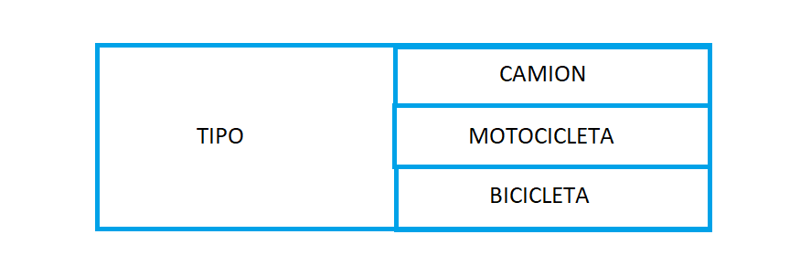
The first method uses the div and col and row, the second uses a table
.border1,
.border2,
.border3 {
  border: black 1px solid;
}

.border2 {
  border-left: none;
  border-bottom: none;
}

.border2,
.border3 {
  border-left: none;
}

.colFix {
  display: table-cell;
  float: none!important;
}
<!-- Latest compiled and minified CSS -->
<link rel="stylesheet" href="https://maxcdn.bootstrapcdn.com/bootstrap/3.3.7/css/bootstrap.min.css">
<!-- jQuery library -->
<script src="https://ajax.googleapis.com/ajax/libs/jquery/3.2.1/jquery.min.js"></script>
<!-- Latest compiled JavaScript -->
<script src="https://maxcdn.bootstrapcdn.com/bootstrap/3.3.7/js/bootstrap.min.js"></script>
<div class="container">
<div class="container">
<h1> Metodo 1</h1>
<div class="row">
<div class="colFix col-xs-6 col-sm-6 border1 ">
<div class="center-block">
<h3>TIPO</h3>
</div>
</div>
<div class="colFix col-xs-6 col-sm-6 ">
<div class="row">
<div class="col-xs-12 col-sm-12 border2">
<h3>CAMION</h3>
</div>
<div class="col-xs-12 col-sm-12 border2">
<h3>MOTOCICLETA</h3>
</div>
<div class="col-xs-12 col-sm-12 border3">
<h3>BICICLETA</h3>
</div>
</div>
</div>
</div>
</div>
<h1> Metodo 2</h1>
<div class="row">
<div class="col-xs-12 col-sm-12">
<table style="width:100%">
<tr>
<td rowspan="3" class="border1">Tipo</td>
<td class="border2">camion</td>
</tr>
<tr>
<td class="border2">Moto</td>
</tr>
<tr>
<td class="border3">Bici</td>
</tr>
</table>
</div>
</div>
</div>
 <html>
 <head>
    <title></title>
    <link rel="stylesheet" href="https://maxcdn.bootstrapcdn.com/bootstrap/3.3.7/css/bootstrap.min.css">
</head>
<body>
    <div class="container">
        <div class="row">
            <div class="col-sm-6" style="border: 1px solid #000; height: 20vh; align-items: center;justify-content: center; text-align: center; display: flex;">
                <div style="">
                <h3>TIPO</h3>
                </div>
            </div>
            <div class="col-sm-6" style="border: 1px solid #000; height: 20vh;">
                <div class="row">

                    <div class="col-sm-12" style="border-bottom:1px solid #000;">
                        <h3>CAMION</h3>
                    </div>
                    <div class="col-sm-12" style="border-bottom:1px solid #000;">
                        <h3>MOTOCICLETA</h3>
                    </div>
                    <div class="col-sm-12">
                        <h3>BICICLETA</h3>
                    </div>
                </div>
            </div>
        </div>
    </div>
</body>
</html>
I recommend using bootstrap , copy and paste this code and run it in full screen, is that what you want? if something you comment ...