Margin on the right side of the page

1

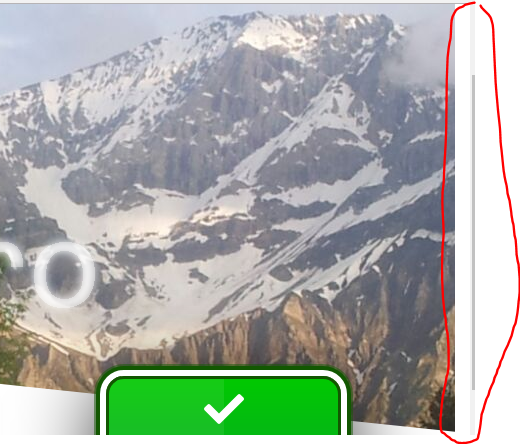
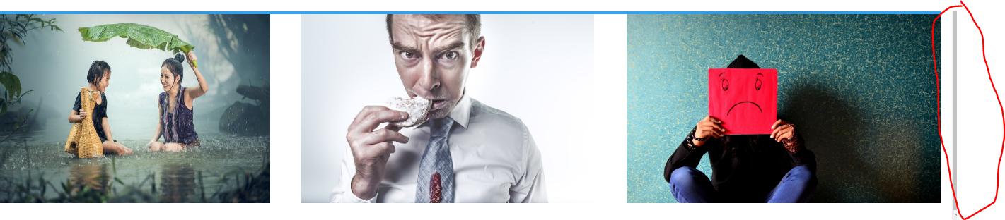
I added 3 images and created a margin of blank space on the right side of the page, as shown in the following screenshots:

Why does that happen and how can I solve it? I upload the code, although when running here it does not show much:

.column {
  float: left;
  width: 33.33%;
  padding: 0;
}

.row::after {
  content: "";
  clear: both;
  display: table;
}

div .column-fisico2 {
  padding-left: 30px;
}
<div class="row">
  <div class="column column-fisico2">
    <img src="https://placehold.it/500x300/" alt="Snow" style="width:90%" height="91%">
  </div>
  <div class="column">
    <img src="https://placehold.it/500x300/" alt="Forest" style="width:90%" height="91%">
  </div>
  <div class="column columna-emocional1">
    <img src="https://placehold.it/500x300/" alt="Mountains" style="width:96.7%" height="91%">
  </div>
</div>
    
asked by Sergio A Castañeda Venegas 07.08.2018 в 08:26
source

4 answers

2

The last image has "style=" width: 96.7% "" the margin on the right is that 3.3% missing. if you need it, why do you want a margin between each image, but that the last one reaches the end, you can do as a bootstrap, which uses a negative margin in the row, and an equal padding in each column:

.row{
  margin-right:-10px;
  margin-left:-10px

}
.column {
  float: left;
  width: 33.33%;
  padding: 0;
  padding-right:10px;
  padding-left:10px
}

It is important to use tb the box-sizing: border-box; for the padding to unite correctly in this case, I usually add it to all the default elements:

* { box-sizing: border-box;}

I leave a link for you to see it working: link

    
answered by 07.08.2018 в 10:39
1

As you said that margin is generated because the last image like the previous does not occupy 100% of the width of the container, so you do not leave that margin to your right you can put 100% of the width, and if you want If there is space between images, you can give padding-left to the images. I also recommend using the universal selector to avoid that the default styles of browsers can give you problems, eliminating the margin and padding and using the property box-sizing as you have indicated above (besides this way you will avoid having to repeat code needlessly). Your example should look more like this:

* {
  margin:0;
  padding:0;
  box-sizing:border-box;
  }
img {
  width:100%;
  padding-left:20px;
  }

.column {
  float: left;
  width: 33.33%;
}
<div class="row">
  <div class="column column-fisico2">
    <img src="https://placehold.it/500x300/" alt="Snow">
  </div>
  <div class="column">
    <img src="https://placehold.it/500x300/" alt="Forest">
  </div>
  <div class="column columna-emocional1">
    <img src="https://placehold.it/500x300/" alt="Mountains">
  </div>
</div>
    
answered by 07.08.2018 в 19:39
0

I do not understand very well because you add one to each of the labels

style="width:90%"

Even so, so that you do not see the edge of the image, you should only do the following.

.column {  
float: left; 
width: 33.33%;
padding: 0;
border:none;
}
    
answered by 07.08.2018 в 09:16
0

Hello what I did was the following use display: flex;

  <!DOCTYPE html>
  <html>
    <head>
      <meta charset="utf-8">
      <meta name="viewport" content="width=device-width">
      <title>JS Bin</title>
    </head>
    <body>
      <div class="row">
      <div class="column column-fisico2">
        <img src="https://placehold.it/500x300/" alt="Snow">
      </div>
      <div class="column">
        <img src="https://placehold.it/500x300/" alt="Forest">
      </div>
      <div class="column columna-emocional1">
        <img src="https://placehold.it/500x300/" alt="Mountains">
      </div>
    </div>
    </body>
  </html>

Then in css I use display: flex; I give a maximum width to the row and to each block I give another width to divide on the screen and the images I leave them at 100%. you can also play with the widths of the images, leave them fixed in px and use a flex-wrap: wrap; to lower the element as float: left .

.row {
  display: flex;
  justify-content: space-between;
  max-width: 1000px;
}

.row .column {
  max-width: 280px;
}

.row .column img {
  max-width: 500px;
  width: 100%;
}
    
answered by 09.08.2018 в 22:18