I would like to know how I can make the page that loads for a menu go out just below this. I leave an image to see how I get.
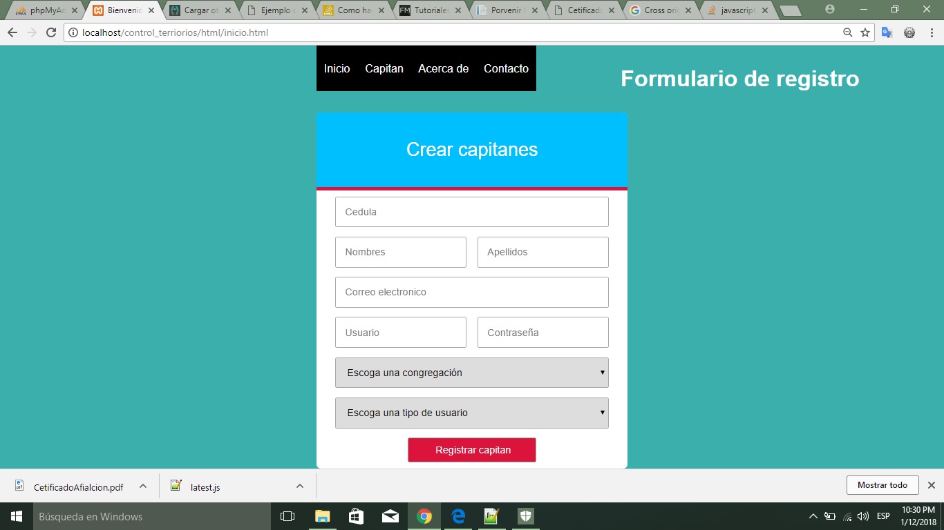
As you can see the page that is loaded should appear just below the menu.
This is the menu code
<!DOCTYPE html>
<html lang = "es">
<head>
	<meta charset = "UTF-8">
	<title>Bienvenido al control de tarjetas</title>
	<meta name="viewport" content="width=device-width, user-scalable=no, initial-scale=1.0, maximum-scale=1.0, minimum-scale=1.0">
	<link rel="stylesheet" href="../css/reg.css">
	<link rel="stylesheet" href="../css/menu.css">
	<script src = "../js/jquery-3.2.1.min.js"></script>
	<script src="../js/menu1.js"></script>
	<script src="../js/menu.js"></script>
</head>
<body>
	<div id="header">
		<ul class="nav">
			<li><a href="#">Inicio</a></li>
			<li><a href="#">Capitan</a>
				<ul>
					<li><a href="../html/registro.html" id = "addCap">Agregar</a></li>
					<li><a href="#">Modificar</a></li>
					<li><a href="#">Eliminar</a></li>
				</ul>
			</li>
			<li><a href="">Acerca de</a>
				<ul>
					<li><a href="#">Submenu1</a></li>
					<li><a href="#">Submenu2</a></li>
					<li><a href="#">Submenu3</a></li>
					<li><a href="#">Submenu4</a></li>
				</ul>
			</li>
			<li><a href="#">Contacto</a></li>
		</ul>
	</div>
	<div id="contenido" name="contenido">
	</div>
</body>
</html>
*
{
	margin:0px;
	padding:0px;
}
#header
{
	margin:auto;
	width:500px;
	font-family:Arial, Helvetica, sans-serif;
}
ul, ol
{
	list-style:none;
}
.nav
{
	width:500px;
	margin:0 auto;
}

.nav > li
 {
	float:left;
}
.nav li a
{
	background-color:#000;
	color:#fff;
	text-decoration:none;
	padding:10px 12px;
	display:block;
}
.nav li a:hover
{
	background-color:#434343;
}
.nav li ul
{
	display:none;
	position:absolute;
	min-width:140px;
}
.nav li:hover > ul
{
	display:block;
}
.nav li ul li
{
	position:relative;
}
.nav li ul li ul
{
	right:-140px;
	top:0px;
}
and this css is the one that I apply to the page as such
*{
	box-sizing: border-box;
}

body{
	font: normal 18px/3 "Fira Sans", "Heveltica Neue", sans-serif;
	background: #3aafab;
	color: white;
	margin: 0;
}

h1{
	text-align: center;
}

.form-registro{
	width: 95%;
	max-width: 500px;
	margin: auto;
	background:white;
	border-radius: 7px;

}
h2{
	background: deepskyblue;
	text-align: center;
	padding: 15px;
	font-weight: 100;
	font-size: 30px;
	border-top-left-radius: 7px;
	border-top-right-radius: 7px;
	border-bottom: 5px solid crimson;
}

.contenedor-input{
	padding: 10px 30px;
	display: flex;
	flex-wrap: wrap;
	justify-content: space-between;
}

input{
	margin-bottom: 15px;
	padding: 15px;
	font-size: 16px;
	border-radius: 3px;
	border: 1px solid darkgrey;
}

.input-48{
	width: 48%;
}

.input-100{
	width: 100%;
}

select
{
    margin-bottom: 15px;
    padding: 15px;
    font-size: 16px;
    border-radius: 3px;
    border: 1px solid darkgrey;
}

.btn-enviar{
	background: crimson;
	color: white;
	margin: auto;
	padding: 10px 40px;
	cursor: pointer;
}

.btn-enviar:active{
	transform: scale(1.05);
}
.contenido{
	display:block
}
Thank you for your help.