Modify responsive dimensions of the bootstrap 3 navbar

1

I am using the following navbar:

And I'm having this problem:

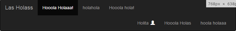
You can see that by the amount of elements that the navbar has, when I reduce the resolution of the screen, the elements that are aligned to the right, are passed down.

I need to avoid that, making the appearance of this:

occurs before the problem described.

The code:

<nav class="navbar navbar-inverse">
  <div class="container-fluid">
    <div class="navbar-header">
      <button type="button" class="navbar-toggle collapsed" data-toggle="collapse" data-target="#bs-example-navbar-collapse-1" aria-expanded="false">
        <span class="sr-only">Toggle navigation</span>
        <span class="icon-bar"></span>
        <span class="icon-bar"></span>
        <span class="icon-bar"></span>
      </button>
      <a class="navbar-brand" href="#">Las Holass</a>
    </div>
    <div class="collapse navbar-collapse" id="bs-example-navbar-collapse-1">
      <ul class="nav navbar-nav">
        <li class="active"><a href="#">Hooola Holaaa!</a></li>
        <li><a href="#">holahola</a></li>
        <li><a href="#">Hooola hola!</a></li>
      </ul>
      <ul class="nav navbar-nav navbar-right">
        <li class="dropdown">
          <a href="#" class="dropdown-hover" data-toggle="dropdown" role="button" aria-haspopup="true" aria-expanded="false">Holita
          <i class="glyphicon glyphicon-user white"></i>
          </a>
          <ul class="dropdown-menu">
            <li><a id="login" href="#">Cerrar Sesión</a></li>
          </ul>
        </li>
        <li><a href="#">Hooola Holas</a></li>
        <li><a href="#">hoola holaaa</a></li>
      </ul>
    </div><!-- fin navbar-collapse -->
  </div><!-- fin container-fluid -->
</nav>

Is there any way to define the minimum width in pixels from which will appear the button of the three white bars that compresses the contents of the navbar?

EDIT

What I need is to establish the maximum width * from which the button indicated above will appear, not the minimum as I described wrongly.

For example, if that button currently appears between 0px and 765px wide, I need it to appear between 0px and 769px wide.

    
asked by Roberto Sepúlveda Bravo 14.11.2016 в 05:07
source

2 answers

1

Change the breakpoint of the navigation bar from 1000px to the desired breakpoint, where you want the navigation bar to contract

@media (max-width: 991px) {
  .navbar-header {
      float: none;
  }
  .navbar-left,.navbar-right {
      float: none !important;
  }
  .navbar-toggle {
      display: block;
  }
  .navbar-collapse {
      border-top: 1px solid transparent;
      box-shadow: inset 0 1px 0 rgba(255,255,255,0.1);
  }
  .navbar-fixed-top {
      top: 0;
      border-width: 0 0 1px;
  }
  .navbar-collapse.collapse {
      display: none!important;
  }
  .navbar-nav {
      float: none!important;
      margin-top: 7.5px;
  }
  .navbar-nav>li {
      float: none;
  }
  .navbar-nav>li>a {
      padding-top: 10px;
      padding-bottom: 10px;
  }
  .collapse.in{
      display:block !important;
  }
}

The solution I found here: link

Some examples: link

Greetings, I hope it serves you.

    
answered by 15.11.2016 / 16:38
source
0

I explain, as I said, one way to do it is to make a media query such that:

@media screen and (max-width: 769px){
    /* aplicas para tu lista (<ul class="nav navbar-nav navbar-right">).
    haces desaparecer el menú para luego llamarlo. */
    ul#menuDerecha{
        display: none;
    }

    /* aplicas para el botón de menú (<button type="button" class="navbar-toggle [...] aria-expanded="false">)
    junto con tu otro menu (<ul class="nav navbar-nav">), y lo suyo es que tengas en fichero funtions.js definido
    el método de click asociado al boton de menú para que aparezca y desaparezca el menu */
    ul#menuIzquierda, button#elBotonMenu{
        display: inline-block;
        vertical-align: middle;
        max-width: 75%;
    }
        button#elBotonMenu{
            max-width: 20%;
        }
    /* Puede que necesites min-with y no max-with... depende de como estén las clases */
}

And I repeat, it's a basic idea, it also depends on the classes that are associated with it.

    
answered by 15.11.2016 в 15:06