What you can do is put a border-width that is half the size of your circle and choose the four colors you want for your circle.
Once this is done, and as you will see it in the form of an "hourglass", you will have to use the function transform: rotate(45) to rotate the circle 45 degrees.
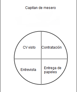
Here is an example:
#circulo{
  position: relative;
  box-sizing: box-shadow;
  height: 200px;
  width: 200px;
  background-color: red;
  border-radius: 50%;
  box-sizing: border-box;
  border-width: 100px;
  border-style: solid;
  border-color: purple orange blue green;
  transform: rotate(45deg);
}

span{
  position: absolute;
  width: 50px;
  transform: rotate(-45deg);
}

#texto1{
   margin-left: -80px;
}

#texto2{
   top: -65px;
   left: -15px;
}

#texto3{
  left: -30px;
  top: 50px;
}

#texto4{
  top: -10px;
  left: 30px;
}
<div id="circulo">
  <span id="texto1">Texto 1</span>
  <span id="texto2">Texto 2</span>
  <span id="texto3">Texto 3</span>
  <span id="texto4">Texto 4</span>
</div>
To put the texts in relation to the circle you can position the circle using position: relative; and each of the texts position them with position: absolute; so that they take this circle as a reference (to position them you can use the properties top , left , bottom , right ).