the flexbox rules in css3 do not work correctly

0

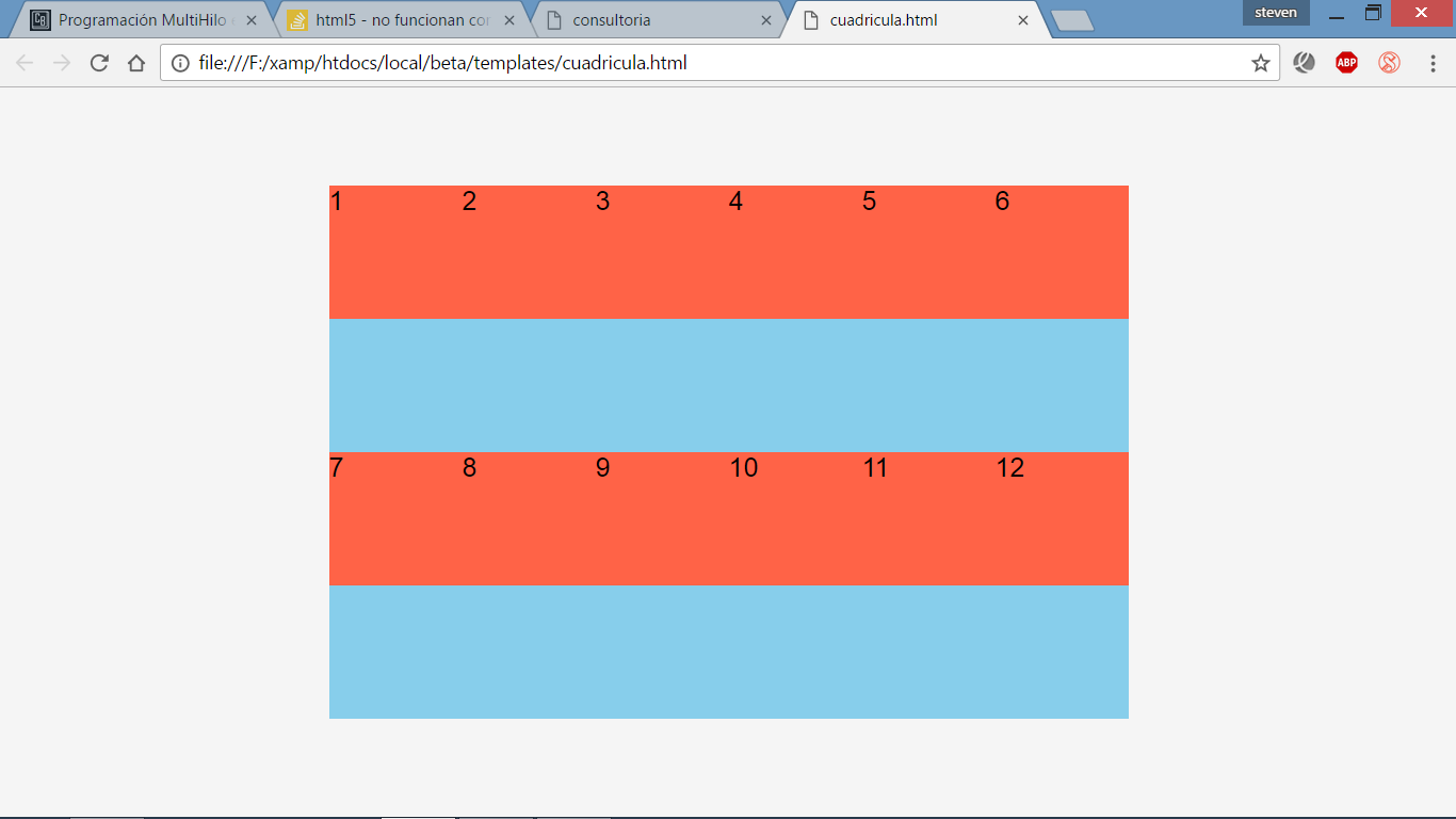
I understand that flexbox is a layout model that allows flexible and responsive content, I've seen a video on YouTube where it shows how to make a perfect grid, I followed all the steps of the video but it does not give me the same result, I do not understand what I'm missing, the video is the following grid with flexbox by alvaro felipe

body {
  background-color: whitesmoke;
  display: flex;
  flex-wrap: wrap;
  margin: 0;
  min-height: 100vh;
}

#contenidoSeccion {
  width: 600px;
  height: 400px;
  background-color: skyblue;
  margin: auto;
  display: flex;
  flex-wrap: wrap;
  justify-content: space-between;
}

div.items {
  background-color: tomato;
  flex: none;
  width: 100px;
  height: 100px;
  justify-content: center;
  align-items: center;
  margin-bottom: 10px;
}
<!DOCTYPE html>
<html lang="en">

<head>
  <meta charset="UTF-8">
  <title>consultoria</title>
  <link href="estilos.css" rel="stylesheet" type="text/css">

</head>

<body>


  <section id="contenidoSeccion">
    <div class="items">1</div>
    <div class="items">2</div>
    <div class="items">3</div>
    <div class="items">4</div>
    <div class="items">5</div>
    <div class="items">6</div>
    <div class="items">7</div>
    <div class="items">8</div>
    <div class="items">9</div>
    <div class="items">10</div>
    <div class="items">11</div>
    <div class="items">12</div>

  </section>

</body>

</html>

layout rules

    
asked by steven 15.04.2017 в 02:03
source

1 answer

2

The problem is that in the video they calculate the width for 4 divs taking into account a margin of 10px width:calc((100% - 10px) / 4); and in your code you give a fixed width of 100px, so in a layer of 600px, they fit 6 without margins .
This vertical separation can be due to the fact that it does not fit due to some margin or uncontrolled padding when not calculating it specifically.

	body {
		background-color: whitesmoke;
		display: flex;
		flex-wrap: wrap;
		margin: 0px;
		min-height: 100vh;
	 }


	#contenidoSeccion {
		width:600px;
		height: 400px;
		background-color: skyblue;
		margin: auto;
		display: flex;
		flex-wrap: wrap;
		justify-content: space-between;
	}

	div.items {
	  background-color: tomato;
	  flex:none;
	  width:calc((100% - 10px) / 4);
	  height: 100px;
	  justify-content: center;
	  align-items: center;
	  margin-bottom:10px;
	}
    <section id="contenidoSeccion">
		<div class="items">1</div>
		<div class="items">2</div>
		<div class="items">3</div>
		<div class="items">4</div>
		<div class="items">5</div>
		<div class="items">6</div>
		<div class="items">7</div>
		<div class="items">8</div>
		<div class="items">9</div>
		<div class="items">10</div>
		<div class="items">11</div>
		<div class="items">12</div>
    </section>
    
answered by 15.04.2017 в 02:46