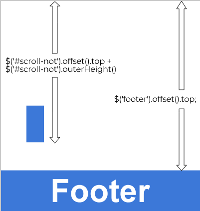
I have some icons which are downloaded when I scroll, but I need to stop before getting to the footer, since they currently go down to the end of the window and are moonted in the footer
HTML
    <head>
        <link href="css/bootstrap.css" rel="stylesheet" media="screen" />
        <script src="http://code.jquery.com/jquery.js "></script>
        <script src="owl_carousel/owl.carousel.min.js"></script>
        <script src="owl_carousel/owl.carousel.min.js"></script>

        <script src="//cdnjs.cloudflare.com/ajax/libs/ScrollMagic/2.0.6/ScrollMagic.min.js"></script>
        <script src="//cdnjs.cloudflare.com/ajax/libs/ScrollMagic/2.0.6/plugins/debug.addIndicators.min.js"></script>
        <script src="js/airNostrum.js "></script>


        <!-- Todos los plugins JavaScript de Bootstrap (también puedes
             incluir archivos JavaScript individuales de los únicos
             plugins que utilices) -->
        <script src="js/bootstrap.min.js "></script>
        <script src="js/menu/menu.js "></script>

        <script src="js/dropdown/dropdown.js "></script>
    </head>

    <body>
        <header>.....</header>
<div class="container pad_top_12">

            <h1 class="arran col-md-8 col-sm-12 col-xs-12 ">Lorem Ipsum has been the industry’s</h1>


            <div class="row flex-nowrap ">

                <div class="hidden-lg hidden-md col-sm-6 col-xs-6 ">
                    <p class="fecha_not text-left mr-2">08 FEB 2018</p>
                </div>
                <div class="hidden-lg hidden-md  col-sm-6 col-xs-6  icon-tab-mov ">
                    <img src="iconos/ic_download.svg" alt="" class="img-dow opac7">
                    <img src="iconos/ic_printer.svg" alt="" class="img-print">
                    <img src="iconos/share_ic.svg" alt="" class="img-share">

                </div>


                <div class="col-lg-12 col-md-12 hidden-sm hidden-xs">
                    <p class="fecha_not ml-2">08 FEB 2018</p>
                </div>
            </div>

            <div class="col-lg-12 col-md-12 col-sm-12 col-xs-12 pad-top-av"><img src="img/iberia_avion.png" alt="" class="img-viaj"></div>
            <div class="col-lg-12 col-md-12 hidden-sm hidden-xs">
                <p class="desc-av ">Lorem ipsum dolor sit amet</p>
            </div>
        <div class="row ">
                    <div class="col-md-2  bar_lat1 " id="scroll-not">
                        <p><img src="iconos/share_ic.svg" alt=""></p>
                        <p><img src="iconos/ic_printer.svg" alt=""></p>
                        <p><img src="iconos/ic_download.svg" alt="" class="opac7"></p>

                    </div>
                    <div class="col-md-2 "></div>
                    <div class="col-md-8 ">
                        <h3 class="not-tit">“Lorem Ipsum has been the industry’s standard dummy text ever since the 1500s”</h3>
                        <p class="tex-not">Lorem Ipsum has been the industry’s standard dummy text ever since the 1500s, when an unknown printer took a galley of type and scrambled it to make a type specimen book. It has survived not only five centuries, but also the leap into
                            electronic typesetting, remaining essentially unchanged. It was popularised in the 1960s with the release of Letraset sheets containing Lorem Ipsum passages, and more recently with desktop publishing software like Aldus PageMaker including
                            versions of Lorem Ipsum.</p>
                        <p class="tex-not">Lorem Ipsum is simply dummy text of the printing and typesetting industry. Lorem Ipsum has been the industry’s standard dummy text ever since the 1500s, when an unknown printer took a galley of type and scrambled it to make a type specimen
                            book. It has survived not only five centuries, but also the leap into electronic typesetting, remaining essentially unchanged. It was popularised in the 1960s with the release of Letraset sheets containing Lorem Ipsum passages, and
                            more recently with desktop publishing software like Aldus PageMaker including versions of Lorem Ipsum.</p>
                        <img src="img/sag_fam_det.png" alt="" class="sag-fam img-viaj">
                        <p class="desc-av1 ">Lorem ipsum dolor sit amet</p>
                        <p class="tex-not">Lorem Ipsum has been the industry’s standard dummy text ever since the 1500s, when an unknown printer took a galley of type and scrambled it to make a type specimen book. It has survived not only five centuries, but also the leap into
                            electronic typesetting, remaining essentially unchanged. It was popularised in the 1960s with the release of Letraset sheets containing Lorem Ipsum passages, and more recently with desktop publishing software like Aldus PageMaker including
                            versions of Lorem Ipsum.</p>
                        <p class="tex-not">Lorem Ipsum is simply dummy text of the printing and typesetting industry. Lorem Ipsum has been the industry’s standard dummy text ever since the 1500s, when an unknown printer took a galley of type and scrambled it to make a type specimen
                            book. It has survived not only five centuries, but also the leap into electronic typesetting, remaining essentially unchanged. It was popularised in the 1960s with the release of Letraset sheets containing Lorem Ipsum passages, and
                            more recently with desktop publishing software like Aldus PageMaker including versions of Lorem Ipsum.</p>
                        <p class="txt-p"><img src="iconos/etiqueta.svg" alt=""><span>  aviones,rutas,ofertas</span></p>
                    </div>
                    <div class="col-md-2 "></div>
                </div>
        <footer>...</footer>
    </body>
JS
 $(document).ready(function() {

        $(function() {

            $(document).on('scroll', function() {

                if ($(window).scrollTop() > 100) {
                    $('#scroll-not').addClass('show');
                } else {
                    $('#scroll-not').removeClass('show');
                }
            });

            $('#scroll-not').on('click', scrollToTop);
            $('#scroll-not').css('background', 'transparent');
        });

        function scrollToTop() {
            verticalOffset = typeof(verticalOffset) != 'undefined' ? verticalOffset : 0;
            element = $('body');
            offset = element.offset();
            offsetTop = offset.top;
            $('html, body').animate({
                scrollTop: offsetTop
            }, 500, 'linear');
        }

    });
CSS
.col-cab {
    background-image: linear-gradient(to bottom, #ffffff, #f7f6f4);
    min-width: 100%;
}

.col-cab1 {
    background-image: linear-gradient(to bottom, #db0829, #a80e20);
    min-width: 100%;
}

.top-cabecera {
    position: absolute;
    z-index: 10000000;
    width: 100%;
    height: 80px;
}

.borde-desplegable1 {
    border-top: 3px red solid !important;
}

.pos-submenu-index {
    float: right;
    right: 25%;
    position: relative;
}

.wrapper-dropdown-2 {
    /* Size and position */
    position: relative;
    margin: 0 auto;
    padding: 10px;
    /* Styles */
    background: transparent;
    border: 0;
    box-shadow: 0;
    cursor: pointer;
    outline: none;
    z-index: 1000000;
}

.wrapper-dropdown-2:after {
    content: "";
    width: 0;
    height: 0;
    position: absolute;
    right: 15px;
    top: 50%;
    margin-top: -3px;
    border-width: 6px 6px 0 6px;
    border-style: solid;
    border-color: #000 transparent;
    z-index: 1000000;
}

.wrapper-dropdown-2 .dropdown {
    /* Size & position */
    position: absolute;
    top: 100%;
    left: 0;
    right: 0;
    padding: 0;
    margin: 0;
    /* Styles */
    background: white;
    border: 1px solid rgba(0, 0, 0, 0.17);
    font-weight: normal;
    -webkit-transition: all 0.5s ease-in;
    -moz-transition: all 0.5s ease-in;
    -ms-transition: all 0.5s ease-in;
    -o-transition: all 0.5s ease-in;
    transition: all 0.5s ease-in;
    list-style: none;
    /* Hiding */
    opacity: 0;
    pointer-events: none;
}

.wrapper-dropdown-2 .dropdown li a {
    display: block;
    padding: 10px;
    text-decoration: none;
    color: #000;
    border-bottom: 1px solid #e6e8ea;
    box-shadow: inset 0 1px 0 rgba(255, 255, 255, 1);
    -webkit-transition: all 0.3s ease-out;
    -moz-transition: all 0.3s ease-out;
    -ms-transition: all 0.3s ease-out;
    -o-transition: all 0.3s ease-out;
    transition: all 0.3s ease-out;
}

.wrapper-dropdown-2 .dropdown li i {
    float: right;
    color: inherit;
}

.wrapper-dropdown-2 .dropdown li:first-of-type a {
    border-radius: 7px 7px 0 0;
}

.wrapper-dropdown-2 .dropdown li:last-of-type a {
    border: none;
    border-radius: 0 0 7px 7px;
}


/* Hover state */

.wrapper-dropdown-2 .dropdown li:hover a {
    background: #f3f8f8;
}


/* Active state */

.wrapper-dropdown-2.active .dropdown {
    opacity: 1;
    pointer-events: auto;
}


/* No CSS3 support */

.no-opacity .wrapper-dropdown-2 .dropdown,
.no-pointerevents .wrapper-dropdown-2 .dropdown {
    display: none;
    opacity: 1;
    /* If opacity support but no pointer-events support */
    pointer-events: auto;
    /* If pointer-events support but no pointer-events support */
}

.no-opacity .wrapper-dropdown-2.active .dropdown,
.no-pointerevents .wrapper-dropdown-3.active .dropdown {
    display: block;
}


/*#############################*/

.posicionamiento_top {
    width: 70%;
    left: 15%;
}

.marg1em {
    padding: 2em 1em;
}

.rojo_bot {
    border-bottom: 3px red solid;
}

.bor_bot {
    border-bottom: solid 1px #e5e5e5;
}

.not {
    font-family: IberiaHeadline;
    font-size: 32px;
    font-weight: normal;
    font-style: normal;
    font-stretch: normal;
    line-height: 1.13;
    letter-spacing: 0.3px;
    color: #0c1332;
}

.eleg {
    font-family: IberiaText;
    font-size: 13px;
    font-weight: normal;
    font-style: normal;
    font-stretch: normal;
    line-height: normal;
    letter-spacing: normal;
    color: #4a4a4a;
    border: 1px solid rgba(151, 151, 151, 0.35);
}

.fecha_not {
    font-family: Verdana;
    font-size: 12px;
    font-weight: normal;
    font-style: normal;
    font-stretch: normal;
    line-height: normal;
    letter-spacing: normal;
    color: #000000;
}

.txt-az {
    font-family: IberiaHeadline;
    font-size: 22px;
    font-weight: normal;
    font-style: normal;
    font-stretch: normal;
    line-height: normal;
    letter-spacing: -0.4px;
    color: #0090d0;
}

.txt-peq {
    font-family: Verdana;
    font-size: 13px;
    font-weight: normal;
    font-style: normal;
    font-stretch: normal;
    line-height: 1.69;
    letter-spacing: -0.2px;
    color: #333333;
}

.gif_not {
    text-align: center;
}

.foot-gr {
    background-color: #f7f6f4;
    padding: 50px 15px;
    margin-top: 3%;
}

.not-wrap {
    display: flex;
    flex-wrap: wrap;
}

.back-wh {}

.centrar_car {
    border: 1px solid red;
}


/*****.back-wh{

   padding: 0;
    background: #fff;
    width: 25%;
    -webkit-order: 0;
    -ms-flex-order: 0;
    order: 0;
    -webkit-flex: 0 1 auto;
    -ms-flex: 0 1 auto;
    flex: 0 1 auto;
    -webkit-align-self: auto;
    -ms-flex-item-align: auto;
    align-self: auto;;
}
.centrar_car{
     display: -ms-flexbox;
    display: -webkit-flex;
    display: flex;
    -webkit-flex-direction: row;
    -ms-flex-direction: row;
    flex-direction: row;
    -webkit-flex-wrap: nowrap;
    -ms-flex-wrap: nowrap;
    flex-wrap: nowrap;
    -webkit-justify-content: space-around;
    -ms-flex-pack: distribute;
    justify-content: space-around;
    -webkit-align-content: space-around;
    -ms-flex-line-pack: distribute;
    align-content: space-around;
    -webkit-align-items: center;
    -ms-flex-align: center;
    align-items: center;

}**/

.foot-gr .cent-bot {
    margin: auto;
}

.tam-cont {
    width: 100%;
    float: none;
    margin: auto;
}

.copiright {
    background-color: #dfe7ef;
    padding-top: 3em;
    font-family: Verdana;
    font-size: 11px;
    font-weight: normal;
    font-style: normal;
    font-stretch: normal;
    line-height: 2;
    letter-spacing: 0.1px;
    color: #0c1332;
    padding-bottom: 2em;
}

.copi-sig {
    text-align: right;
}

@media only screen and (max-width:450px) {
    .cop_resp {
        display: none;
    }
    .cop_resp1 {
        display: block;
    }
    .cop-air {
        padding-top: 1em;
    }
}

@media only screen and (min-width:449px) {
    .cop_resp1 {
        display: none;
    }
}

.ico-rs {
    padding: 0 4%
}

.pr-1 {
    padding-right: 1em
}

.copiright {
    width: 100%;
    font-family: IberiaText;
    font-size: 11px;
    font-weight: normal;
    font-style: normal;
    font-stretch: normal;
    line-height: 2;
    letter-spacing: 0.2px;
    color: #0c1332;
}


/****************carrusel************/

.foot-gr .thumb-smar {
    margin-bottom: 40px;
}

.multi-carousel {
    opacity: 0;
    padding: 0 50px;
}

.multi-carousel .carousel-control-next,
.multi-carousel .carousel-control-prev {
    width: 25px;
    background: gray;
}

.item {
    margin-left: auto;
    margin-right: auto;
    width: 80%;
    border: solid 1px #dbdbdb;
}

.owl-carousel .nav-btn {
    height: 47px;
    position: absolute;
    width: 26px;
    cursor: pointer;
    bottom: 42%;
}

.owl-carousel .owl-prev.disabled,
.owl-carousel .owl-next.disabled {
    pointer-events: none;
    opacity: 0.2;
}

.owl-carousel .prev-slide {
    background-image: url(../img/flecha-air-izq.png);
    left: -1%;
    background-repeat: no-repeat;
    background-size: 40px;
    width: 40px;
}

.owl-carousel .next-slide {
    background-image: url(../img/flecha_air.png);
    right: -1%;
    background-repeat: no-repeat;
    background-size: 40px;
    width: 40px;
}

.border_pr {
    border: 1px solid red;
}

.not_az {
    font-family: IberiaText;
    font-size: 13px;
    font-weight: normal;
    font-style: normal;
    font-stretch: normal;
    line-height: 3.08;
    letter-spacing: normal;
    color: #0090d0;
}

.fl-not {
    color: #6d6f7b;
}

.arran {
    font-family: IberiaHeadline;
    font-size: 48px;
    font-weight: normal;
    font-style: normal;
    font-stretch: normal;
    line-height: 1;
    letter-spacing: normal;
    color: #6d6f7b;
}

.desc-av {
    font-family: IberiaText;
    font-size: 14px;
    font-weight: normal;
    font-style: italic;
    font-stretch: normal;
    line-height: 1.57;
    letter-spacing: normal;
    color: #9b9b9b;
    padding-top: 2em;
    padding-bottom: 4em;
}

.desc-av1 {
    font-family: IberiaText;
    font-size: 14px;
    font-weight: normal;
    font-style: italic;
    font-stretch: normal;
    line-height: 1.57;
    letter-spacing: normal;
    color: #9b9b9b;
    padding-top: 2em;
    padding-bottom: 4em;
}


@media only screen and (max-width:1366px) {
    .item {
        width: 70%;
    }
}

img {
    max-width: 100%;
}

.pad_top {
    padding-top: 1em;
}
.pad_top_mant{
    padding-top: 12em
}

.pad_top_12 {
    padding-top: 12em;
}
.pad_top_12_res{
      padding-top: 12em;
}
@media only screen and (max-width:880px){
.pad_top {
    padding-top: 2em;
}

}
@media only screen and (max-width:990px) {
   .pad_top_12 {
    padding-top: 6em;
}
}
@media only screen and (max-width:1366px) {
      .pad_top_12_res {
    padding-top: 6em;
}
}
.pad_top1 {
    padding-top: 3em;
}

.pad-top-av {
    padding-top: 1em;
}

.not-tit {
    font-family: IberiaHeadline;
    font-size: 25px;
    font-weight: normal;
    font-style: normal;
    font-stretch: normal;
    line-height: normal;
    letter-spacing: normal;
    color: #4a4a4a;
    padding-bottom: 1em;
}

.tex-not {
    font-family: IberiaText;
    font-size: 16px;
    font-weight: normal;
    font-style: normal;
    font-stretch: normal;
    line-height: 1.56;
    letter-spacing: normal;
    text-align: justify;
    color: #33333a;
}

.mar-l-2 {
    margin-left: 2em;
    margin-top: -2em;
}

.txt-p {
    font-family: IberiaText;
    font-size: 14px;
    font-weight: normal;
    font-style: normal;
    font-stretch: normal;
    line-height: 1.57;
    letter-spacing: normal;
    color: #0090d0;
    padding-top: 2em;
}

.txt-p img {
    padding-right: 2%;
}

.img-share {
    padding-right: 1em;
    border-right: 1px solid #979797;
}

.img-dow {
    border-left: 1px solid #979797;
    margin-left: 1em;
    padding-left: 1em;
}

.opac7 {
    opacity: 0.7
}

.img-print {
    padding-left: 1em;
}

.bar_lat {
    position: fixed;
    top: 70%;
    right: 70%;
    border-right: solid 1px #979797;
    width: 80px;
    z-index: 10;
}


/*.bar_lat1{

    position: fixed;
    top: 98%;
 right: 75%;
    border-right: solid 1px #979797;
    width: 80px;


}*/

#scroll-not:hover {
    background-color: red;
}

@media only screen and (min-width:1367px) {
    .icon-tab-mov img {
        display: none;
    }
}

@media only screen and (max-width:991px) {
    .bar_lat1 {
        display: none;
    }
    .fecha_not {
        text-align: left;
    }
    .icon-tab-mov1 {
        display: flex;
        flex-direction: row-reverse;
        padding-right: 3em;
    }
    .icon-tab-mov {
        display: flex;
        flex-direction: row-reverse;
        padding-right: 3em;
    }
    .mar-l-2 .sag-fam {
        display: block;
        margin: auto
    }
    .mar-l-2 {
        margin: auto;
    }
}

@media only screen and (max-width:990px) and (min-width:669px) {
    .arran {
        font-size: 40px;
    }
    .not_az {
        font-size: 13px;
    }
    .icon-tab-mov img {
        width: 32px;
    }
    .not-tit {
        font-size: 25px;
    }
}

@media only screen and (max-width:668px) {
    .arran {
        font-size: 28px;
    }
    .not_az {
        font-size: 13px;
    }
    .icon-tab-mov img {
        width: 29px;
    }
    .not-tit {
        font-family: IberiaHeadline;
        font-size: 18px;
        font-weight: normal;
        font-style: normal;
        font-stretch: normal;
        line-height: 1.39;
        letter-spacing: normal;
        color: #4a4a4a;
    }
    .tex-not {
        font-family: IberiaText;
        font-size: 16px;
        font-weight: normal;
        font-style: normal;
        font-stretch: normal;
        line-height: 1.56;
        letter-spacing: normal;
        text-align: justify;
        color: #4a4a4a;
    }
    .desc-av1 {
        padding-bottom: 2em;
    }
}

.cab-gris {
    background-image: linear-gradient(to bottom, #ffffff, #f7f6f4);
}

.not-desp {
    position: relative;
    z-index: 1;
}

.img-resp {
    height: 100%;
}

.active .pad-rojo {
    border-bottom: 3px solid red;
}

.img-viaj {
    width: 100%
}

@media only screen and (max-width:992px) {
    .pad-top-av {
        margin-bottom: 2em;
    }
}

.ml-2 {
    margin-left: 2em;
}

.pl-2 {
    padding-left: 2em;
}

.pr-2 {
    padding-right: 2em;
}

.pad_top_med {
    padding-top: 15px
}

#scroll-not {
    position: fixed;
    opacity: 0;
    visibility: hidden;
    overflow: hidden;
    border-right: 1px solid #979797;
    z-index: 99999999;
    width: 55px;
    color: #eeeeee;
    line-height: 48px;
    bottom: 25px;
    padding-top: 2px;
    -webkit-transition: all 0.5s ease-in-out;
    -moz-transition: all 0.5s ease-in-out;
    -ms-transition: all 0.5s ease-in-out;
    -o-transition: all 0.5s ease-in-out;
    transition: all 0.5s ease-in-out;
}

@media only screen and (max-width:1698px) and (min-width:1429px) {
    #scroll-not {
        right: 80%;
    }
}

@media only screen and (max-width:1430px) and (min-width:992px) {
    #scroll-not {
        right: 85%;
    }
    .top-cabecera {
        position: absolute;
        z-index: 10000000;
        width: 92%;
        margin-top: 0;
        margin-left: 0;
        height: 60px;
        left: 0;
    }
}

#scroll-not:hover {
    background-color: #888888;
}

#scroll-not.show {
    visibility: visible;
    cursor: pointer;
    opacity: 1.0;
}

@media only screen and (max-width:991px) {
    #scroll-not {
        display: none!important;
    }
}


.peg_abajo {

}

@media (max-width: 480px) and (min-width: 320px) {
    .pos-lupa {
        position: relative;
        left: 65%;
        width: 51%;
    }
    .pos-logo {
        position: relative;
        left: 8%;
    }
    .lupa {
        margin-top: -56px;
        margin-left: 30px;
    }
    .top-cabecera {
        position: absolute;
        z-index: 10000000;
        width: 85%;
        margin-top: 0;
        margin-left: 0;
        height: 75px;
    }
}

@media (max-width: 1023px) and (min-width: 768px) {
    .pos-enlaces-form {
        position: relative;
        margin-top: 17px;
        left: 0;
        margin-left: 50%;
        width: 350px;
    }
    .pos-logo {
        position: relative;
        left: 5%;
        /* width: 45%; */
    }
}

@media (min-width: 481px) and (max-width: 767px) {
    .col-cab {
        background-image: linear-gradient(to bottom, #ffffff, #f7f6f4);
        max-width: 100%;
        min-width: 0;
    }
    .pos-enlaces-form {
        position: relative;
        margin-top: 17px;
        left: 0;
        margin-left: 50%;
        width: 350px;
    }
    .pos-logo {
        position: relative;
        left: 0;
        width: 70%;
    }
    .posicionamiento_top {
        width: 100%;
        left: 0;
    }
    .top-cabecera-multimedia {
        margin-top: 0;
        width: 89% !important;
    }
    .pos-enlaces-form {
        position: relative;
        margin-top: -5px;
        left: 0;
        margin-left: 50%;
        width: 90%;
    }
    .lupa {
        position: absolute;
        margin-top: -25px;
        margin-left: 65%;
    }
}
.pt-1{
    padding-top: 1em;
}
/**********home*****************/
#video-viewport { position: absolute; top: -10px; left: 0; width: 100%; overflow: hidden; z-index: -1; }
video { display: block; width: 100%; height: auto; }
how can I do to stop the "share, print and download" icons when they arrive at the footer.
Thank you very much, best regards