Problems with click jquery event when resizing screen

0

It turns out that I have this problem

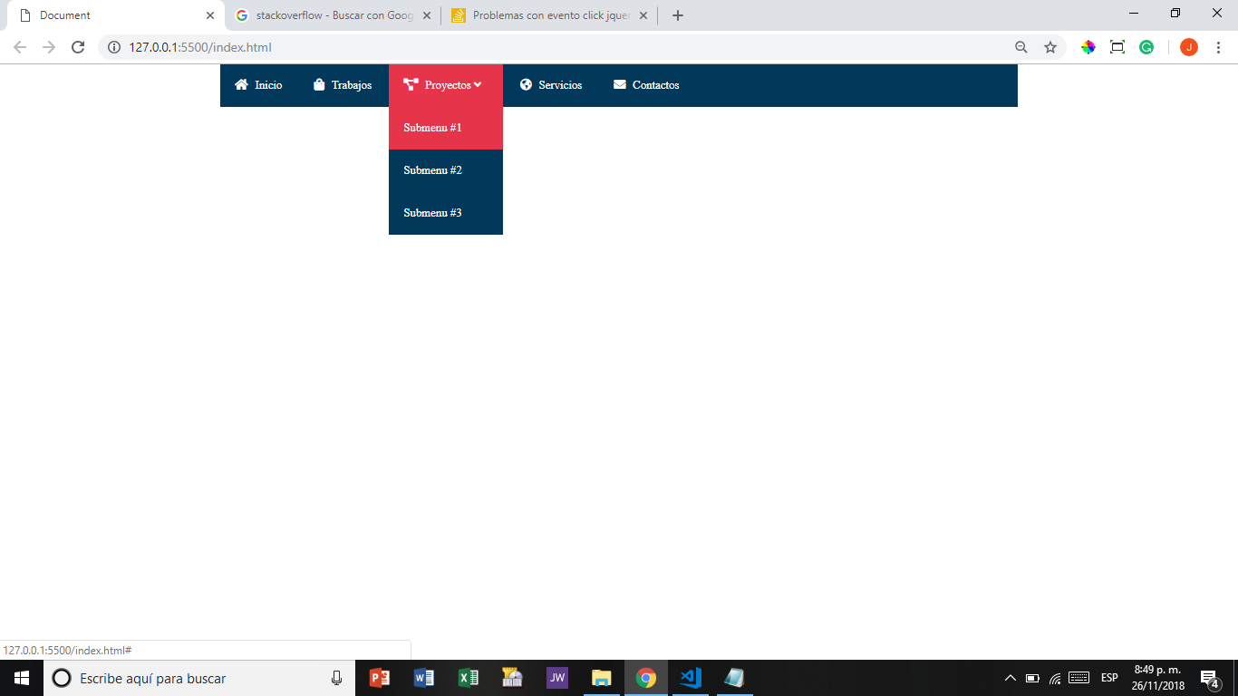
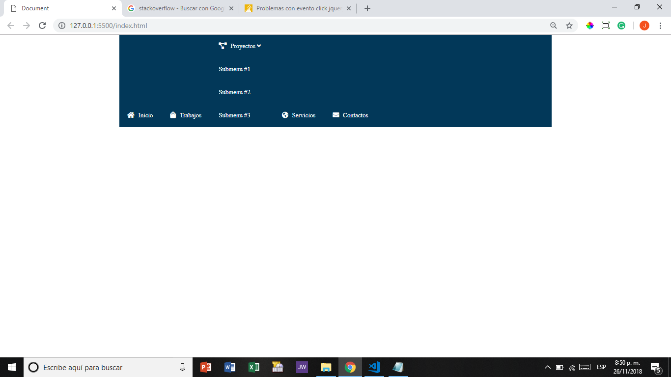
If you notice when I give the mouse menu to the submenu, all the nav disproportions. But when I open the page for the first time it works well. The problem is when I first open mobile mode and I click on the button so that the menu is displayed and I work this event in mobile mode and then redromatose it on a big screen, that's what happens to me.

$(document).ready(function(){

	
		if($(window).width() <=768){

			var contador=1;

			$('.menu-bar').on('click',function(event){
				event.preventDefault();
				if (contador==1) {
					$("nav").animate({
						left: '0'
					});
					contador = 0;
				} else {
					contador = 1;
					$("nav").animate({
						left: '-100%'
					});
				}
			});
		 
			// Mostramos y ocultamos submenus
			
			$('.submenu').click(function(even){
				event.preventDefault();
				event.stopPropagation();
				$(this).children('ul').slideToggle(700);
			});
		
		
	}


});
html{
    box-sizing: border-box;
}

*,*::before,*::after{
    box-sizing: inherit;
    padding: 0;
    margin: 0;
}

.clearfix::before,.clearfix::after{
    content: '';
    display: table;
}

.clearfix::after{
    clear: both;
}

ul{
    list-style-type: none;
}

a{
    text-decoration: none;
}

div.menu-bar{
    display: none;
}

header{
    width: 100%;
}

header nav{
    background-color: #023859;
    width: 95%;
    margin: 0 auto;
    max-width: 1100px;
}

header nav ul li{
    display: inline-block;
    position: relative;
}

header nav ul li ul{
    display: none;
}

header nav ul li a{
    display: block;
    padding: 20px;
    color: #fff;
}

header nav ul li:hover{
    background: #E6344A;
} 

header nav ul li i{
    margin-right: 10px;
}

header nav ul li:hover .hijos{
    display: block;
    position: absolute;
    background: #023859;
    width: 100%;
    z-index: 1;
}

header nav ul .submenu li{
    display: block;
}

@media only screen and (max-width:768px){
    body{
        padding-top: 80px;
    }
    div.menu-bar{
        display: block;
        background-color: #E6344A;
        overflow: hidden;
        position: fixed;
        top: 0;
        width: 100%;
    }
    
    a.btn-menu{
        display: block;
        padding: 25px;
        color: #fff;
        font-size: 25px;
    }
    
    a.btn-menu i{
        float: right;
    }
    header nav{
        height: calc(100% - 80px);
        position: fixed;
        left: -100%;
    }
    
    header nav ul li{
        display: block;
        border-bottom: 1px solid rgba(255,255,255,.5);
    }
    
    header nav ul li:hover .hijos{
        position: relative;
        display: none;
    }
    
    header nav ul li .hijos a{
        margin-left: 30px;
    }
}
<!DOCTYPE html>
<html lang="es">
<head>
    <meta charset="UTF-8">
    <meta name="viewport" content="width=device-width, initial-scale=1.0">
    <meta http-equiv="X-UA-Compatible" content="ie=edge">
    <link rel="stylesheet" href="main.css">
    <link rel="stylesheet" href="https://use.fontawesome.com/releases/v5.2.0/css/all.css">
    <script src="http://code.jquery.com/jquery-latest.min.js"></script>
    <script src="script.js"></script>
   
    <title>Document</title>
</head>
<body>
  <header>
      <div class="menu-bar">
          <a href="" class="btn-menu"><i class="fas fa-bars"></i>Menu</a>
      </div>
      <nav>
          <ul>
              <li><a href=""><i class="fas fa-home"></i>Inicio</a></li>
              <li><a href=""><i class="fas fa-shopping-bag"></i>Trabajos</a></li>
              <li class="submenu">
               <a href=""><i class="fas fa-project-diagram"></i>Proyectos <i class="fas fa-angle-down caret"></i></a>
               <ul class="hijos">
                   <li><a href="#">Submenu #1</a></li>
                   <li><a href="#">Submenu #2</a></li>
                   <li><a href="#">Submenu #3</a></li>
               </ul>
              </li>
              <li><a href=""><i class="fas fa-globe-americas"></i>Servicios</a></li>
              <li><a href=""><i class="fas fa-envelope"></i>Contactos</a></li>
          </ul>
      </nav>
  </header>
   
</body>
</html>

I tried to work with a conditional that executes the click event only if the width of the document is greater than 768 but it does not work. Does anyone have any idea how I can correct it?

    
asked by Jesu 27.11.2018 в 02:58
source

1 answer

0

you must always place the state at .hijos as position:absolute; not only when you do hover
note: the hover effect will be canceled with the click by the slideToggle

$(document).ready(function(){

	
		if($(window).width() <=768){

			var contador=1;

			$('.menu-bar').on('click',function(event){
				event.preventDefault();
				if (contador==1) {
					$("nav").animate({
						left: '0'
					});
					contador = 0;
				} else {
					contador = 1;
					$("nav").animate({
						left: '-100%'
					});
				}
			});
		 
			// Mostramos y ocultamos submenus
			
			$('.submenu').click(function(even){
				event.preventDefault();
				event.stopPropagation();
				$(this).children('ul').slideToggle(700);
			});
		
		
	}


});
html{
    box-sizing: border-box;
}

*,*::before,*::after{
    box-sizing: inherit;
    padding: 0;
    margin: 0;
}

.clearfix::before,.clearfix::after{
    content: '';
    display: table;
}

.clearfix::after{
    clear: both;
}

ul{
    list-style-type: none;
}

a{
    text-decoration: none;
}

div.menu-bar{
    display: none;
}

header{
    width: 100%;
}

header nav{
    background-color: #023859;
    width: 95%;
    margin: 0 auto;
    max-width: 1100px;
}

header nav ul li{
    display: inline-block;
    position: relative;
}

header nav ul li ul{
    display: none;
}

header nav ul li a{
    display: block;
    padding: 20px;
    color: #fff;
}

header nav ul li:hover{
    background: #E6344A;
} 

header nav ul li i{
    margin-right: 10px;
}
.hijos{    position: absolute;}
header nav ul li:hover .hijos{
    display: block;
    background: #023859;
    width: 100%;
    z-index: 1;
}

header nav ul .submenu li{
    display: block;
}

@media only screen and (max-width:768px){
    body{
        padding-top: 80px;
    }
    div.menu-bar{
        display: block;
        background-color: #E6344A;
        overflow: hidden;
        position: fixed;
        top: 0;
        width: 100%;
    }
    
    a.btn-menu{
        display: block;
        padding: 25px;
        color: #fff;
        font-size: 25px;
    }
    
    a.btn-menu i{
        float: right;
    }
    header nav{
        height: calc(100% - 80px);
        position: fixed;
        left: -100%;
    }
    
    header nav ul li{
        display: block;
        border-bottom: 1px solid rgba(255,255,255,.5);
    }
    
    header nav ul li:hover .hijos{
        position: relative;
        display: none;
    }
    
    header nav ul li .hijos a{
        margin-left: 30px;
    }
}
<!DOCTYPE html>
<html lang="es">
<head>
    <meta charset="UTF-8">
    <meta name="viewport" content="width=device-width, initial-scale=1.0">
    <meta http-equiv="X-UA-Compatible" content="ie=edge">
    <link rel="stylesheet" href="main.css">
    <link rel="stylesheet" href="https://use.fontawesome.com/releases/v5.2.0/css/all.css">
    <script src="http://code.jquery.com/jquery-latest.min.js"></script>
    <script src="script.js"></script>
   
    <title>Document</title>
</head>
<body>
  <header>
      <div class="menu-bar">
          <a href="" class="btn-menu"><i class="fas fa-bars"></i>Menu</a>
      </div>
      <nav>
          <ul>
              <li><a href=""><i class="fas fa-home"></i>Inicio</a></li>
              <li><a href=""><i class="fas fa-shopping-bag"></i>Trabajos</a></li>
              <li class="submenu">
               <a href=""><i class="fas fa-project-diagram"></i>Proyectos <i class="fas fa-angle-down caret"></i></a>
               <ul class="hijos">
                   <li><a href="#">Submenu #1</a></li>
                   <li><a href="#">Submenu #2</a></li>
                   <li><a href="#">Submenu #3</a></li>
               </ul>
              </li>
              <li><a href=""><i class="fas fa-globe-americas"></i>Servicios</a></li>
              <li><a href=""><i class="fas fa-envelope"></i>Contactos</a></li>
          </ul>
      </nav>
  </header>
   
</body>
</html>
    
answered by 27.11.2018 в 04:06