Field input text stands out from the form

0

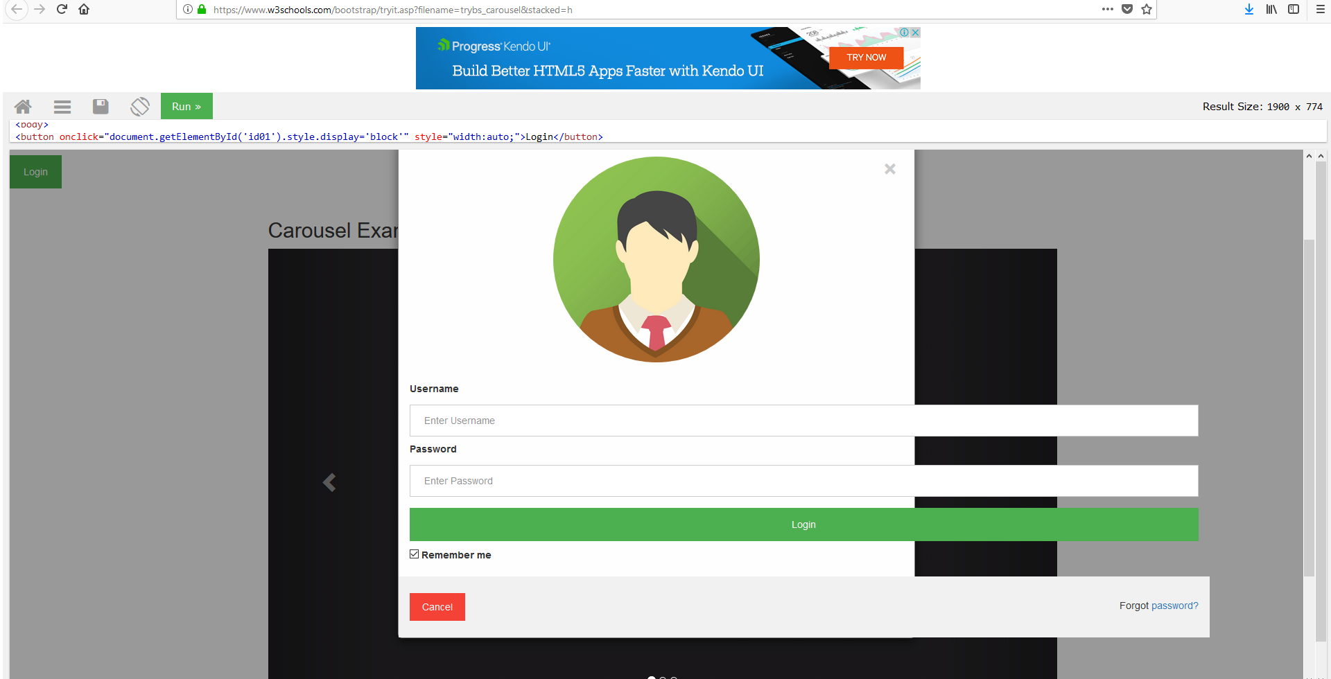
By implementing modal login to my page the elements of the Modal form overflow The code is based on these two links and what I want is the union of both in my page      link      link

// Get the modal
var modal = document.getElementById('id01');

// When the user clicks anywhere outside of the modal, close it
window.onclick = function(event) {
  if (event.target == modal) {
    modal.style.display = "none";
  }
}
input[type=text],
input[type=password] {
  width: 100%;
  padding: 12px 20px;
  margin: 8px 0;
  display: inline-block;
  border: 1px solid #ccc;
  box-sizing: border-box;
}


/* Set a style for all buttons */

button {
  background-color: #4CAF50;
  color: white;
  padding: 14px 20px;
  margin: 8px 0;
  border: none;
  cursor: pointer;
  width: 100%;
}

button:hover {
  opacity: 0.8;
}


/* Extra styles for the cancel button */

.cancelbtn {
  width: auto;
  padding: 10px 18px;
  background-color: #f44336;
}


/* Center the image and position the close button */

.imgcontainer {
  text-align: center;
  margin: 24px 0 12px 0;
  position: relative;
}

img.avatar {
  width: 40%;
  border-radius: 50%;
}

.container {
  padding: 16px;
}

span.psw {
  float: right;
  padding-top: 16px;
}


/* The Modal (background) */

.modal {
  display: none;
  /* Hidden by default */
  position: fixed;
  /* Stay in place */
  z-index: 1;
  /* Sit on top */
  left: 0;
  top: 0;
  width: 100%;
  /* Full width */
  height: 100%;
  /* Full height */
  overflow: auto;
  /* Enable scroll if needed */
  background-color: rgb(0, 0, 0);
  /* Fallback color */
  background-color: rgba(0, 0, 0, 0.4);
  /* Black w/ opacity */
  padding-top: 60px;
}


/* Modal Content/Box */

.modal-content {
  background-color: #fefefe;
  margin: 5% auto 15% auto;
  /* 5% from the top, 15% from the bottom and centered */
  border: 1px solid #888;
  width: 40%;
  /* Could be more or less, depending on screen size */
}


/* The Close Button (x)*/

.close {
  position: absolute;
  right: 25px;
  top: 0;
  color: #000;
  font-size: 35px;
  font-weight: bold;
}

.close:hover,
.close:focus {
  color: red;
  cursor: pointer;
}


/* Add Zoom Animation */

.animate {
  -webkit-animation: animatezoom 0.6s;
  animation: animatezoom 0.6s
}

@-webkit-keyframes animatezoom {
  from {
    -webkit-transform: scale(0)
  }
  to {
    -webkit-transform: scale(1)
  }
}

@keyframes animatezoom {
  from {
    transform: scale(0)
  }
  to {
    transform: scale(1)
  }
}


/* Change styles for span and cancel button on extra small screens */

@media screen and (max-width: 300px) {
  span.psw {
    display: block;
    float: none;
  }
  .cancelbtn {
    width: 100%;
  }
}
<!DOCTYPE html>
<html lang="en">

<head>
  <title>Bootstrap Example</title>
  <meta charset="utf-8">
  <meta name="viewport" content="width=device-width, initial-scale=1">
  <link rel="stylesheet" href="https://maxcdn.bootstrapcdn.com/bootstrap/3.3.7/css/bootstrap.min.css">
  <script src="https://ajax.googleapis.com/ajax/libs/jquery/3.3.1/jquery.min.js"></script>
  <script src="https://maxcdn.bootstrapcdn.com/bootstrap/3.3.7/js/bootstrap.min.js"></script>

  <body>
    <button onclick="document.getElementById('id01').style.display='block'" style="width:auto;">Login</button>

    <div id="id01" class="modal">

      <form class="modal-content animate" action="/action_page.php">
        <div class="imgcontainer">
          <span onclick="document.getElementById('id01').style.display='none'" class="close" title="Close Modal">&times;</span>
          <img src="img_avatar2.png" alt="Avatar" class="avatar">
        </div>

        <div class="container">
          <label for="uname"><b>Username</b></label>
          <input type="text" placeholder="Enter Username" name="uname" required>

          <label for="psw"><b>Password</b></label>
          <input type="password" placeholder="Enter Password" name="psw" required>

          <button type="submit">Login</button>
          <label>
        <input type="checkbox" checked="checked" name="remember"> Remember me
      </label>
        </div>

        <div class="container" style="background-color:#f1f1f1">
          <button type="button" onclick="document.getElementById('id01').style.display='none'" class="cancelbtn">Cancel</button>
          <span class="psw">Forgot <a href="#">password?</a></span>
        </div>
      </form>
    </div>
    <div class="container">
      <h2>Carousel Example</h2>
      <div id="myCarousel" class="carousel slide" data-ride="carousel">
        <!-- Indicators -->
        <ol class="carousel-indicators">
          <li data-target="#myCarousel" data-slide-to="0" class="active"></li>
          <li data-target="#myCarousel" data-slide-to="1"></li>
          <li data-target="#myCarousel" data-slide-to="2"></li>
        </ol>

        <!-- Wrapper for slides -->
        <div class="carousel-inner">
          <div class="item active">
            <img src="https://www.w3schools.com/bootstrap/la.jpg" alt="Los Angeles" style="width:100%;">
          </div>

          <div class="item">
            <img src="https://www.w3schools.com/bootstrap/chicago.jpg" alt="Chicago" style="width:100%;">
          </div>

          <div class="item">
            <img src="https://www.w3schools.com/bootstrap/ny.jpg" alt="New york" style="width:100%;">
          </div>
        </div>

        <!-- Left and right controls -->
        <a class="left carousel-control" href="#myCarousel" data-slide="prev">
          <span class="glyphicon glyphicon-chevron-left"></span>
          <span class="sr-only">Previous</span>
        </a>
        <a class="right carousel-control" href="#myCarousel" data-slide="next">
          <span class="glyphicon glyphicon-chevron-right"></span>
          <span class="sr-only">Next</span>
        </a>
      </div>
    </div>

  </body>

</html>

THIS IS THE RESULT

    
asked by LUNA95087 25.09.2018 в 20:26
source

3 answers

0

For some reason a @media sets your class .container in 1170px limiting this class to 100% is solved, I hope it works for you.

// Get the modal
var modal = document.getElementById('id01');

// When the user clicks anywhere outside of the modal, close it
window.onclick = function(event) {
  if (event.target == modal) {
    modal.style.display = "none";
  }
}
input[type=text],
input[type=password] {
  width: 100%;
  padding: 12px 20px;
  margin: 8px 0;
  display: inline-block;
  border: 1px solid #ccc;
  box-sizing: border-box;
}


/* Set a style for all buttons */

button {
  background-color: #4CAF50;
  color: white;
  padding: 14px 20px;
  margin: 8px 0;
  border: none;
  cursor: pointer;
  width: 100%;
}

button:hover {
  opacity: 0.8;
}


/* Extra styles for the cancel button */

.cancelbtn {
  width: auto;
  padding: 10px 18px;
  background-color: #f44336;
}


/* Center the image and position the close button */

.imgcontainer {
  text-align: center;
  margin: 24px 0 12px 0;
  position: relative;
}

img.avatar {
  width: 40%;
  border-radius: 50%;
}

.container {
  padding: 16px;
  width:100% !important;
}

span.psw {
  float: right;
  padding-top: 16px;
}


/* The Modal (background) */

.modal {
  display: none;
  /* Hidden by default */
  position: fixed;
  /* Stay in place */
  z-index: 1;
  /* Sit on top */
  left: 0;
  top: 0;
  width: 100%;
  /* Full width */
  height: 100%;
  /* Full height */
  overflow: auto;
  /* Enable scroll if needed */
  background-color: rgb(0, 0, 0);
  /* Fallback color */
  background-color: rgba(0, 0, 0, 0.4);
  /* Black w/ opacity */
  padding-top: 60px;
}


/* Modal Content/Box */

.modal-content {
  background-color: #fefefe;
  margin: 5% auto 15% auto;
  /* 5% from the top, 15% from the bottom and centered */
  border: 1px solid #888;
  width: 40%;
  /* Could be more or less, depending on screen size */
}


/* The Close Button (x)*/

.close {
  position: absolute;
  right: 25px;
  top: 0;
  color: #000;
  font-size: 35px;
  font-weight: bold;
}

.close:hover,
.close:focus {
  color: red;
  cursor: pointer;
}


/* Add Zoom Animation */

.animate {
  -webkit-animation: animatezoom 0.6s;
  animation: animatezoom 0.6s
}

@-webkit-keyframes animatezoom {
  from {
    -webkit-transform: scale(0)
  }
  to {
    -webkit-transform: scale(1)
  }
}

@keyframes animatezoom {
  from {
    transform: scale(0)
  }
  to {
    transform: scale(1)
  }
}


/* Change styles for span and cancel button on extra small screens */

@media screen and (max-width: 300px) {
  span.psw {
    display: block;
    float: none;
  }
  .cancelbtn {
    width: 100%;
  }
}
<!DOCTYPE html>
<html lang="en">

<head>
  <title>Bootstrap Example</title>
  <meta charset="utf-8">
  <meta name="viewport" content="width=device-width, initial-scale=1">
  <link rel="stylesheet" href="https://maxcdn.bootstrapcdn.com/bootstrap/3.3.7/css/bootstrap.min.css">
  <script src="https://ajax.googleapis.com/ajax/libs/jquery/3.3.1/jquery.min.js"></script>
  <script src="https://maxcdn.bootstrapcdn.com/bootstrap/3.3.7/js/bootstrap.min.js"></script>

  <body>
    <button onclick="document.getElementById('id01').style.display='block'" style="width:auto;">Login</button>

    <div id="id01" class="modal">

      <form class="modal-content animate" action="/action_page.php">
        <div class="imgcontainer">
          <span onclick="document.getElementById('id01').style.display='none'" class="close" title="Close Modal">&times;</span>
          <img src="img_avatar2.png" alt="Avatar" class="avatar">
        </div>

        <div class="container">
          <label for="uname"><b>Username</b></label>
          <input type="text" placeholder="Enter Username" name="uname" required>

          <label for="psw"><b>Password</b></label>
          <input type="password" placeholder="Enter Password" name="psw" required>

          <button type="submit">Login</button>
          <label>
        <input type="checkbox" checked="checked" name="remember"> Remember me
      </label>
        </div>

        <div class="container" style="background-color:#f1f1f1">
          <button type="button" onclick="document.getElementById('id01').style.display='none'" class="cancelbtn">Cancel</button>
          <span class="psw">Forgot <a href="#">password?</a></span>
        </div>
      </form>
    </div>
    <div class="container">
      <h2>Carousel Example</h2>
      <div id="myCarousel" class="carousel slide" data-ride="carousel">
        <!-- Indicators -->
        <ol class="carousel-indicators">
          <li data-target="#myCarousel" data-slide-to="0" class="active"></li>
          <li data-target="#myCarousel" data-slide-to="1"></li>
          <li data-target="#myCarousel" data-slide-to="2"></li>
        </ol>

        <!-- Wrapper for slides -->
        <div class="carousel-inner">
          <div class="item active">
            <img src="https://www.w3schools.com/bootstrap/la.jpg" alt="Los Angeles" style="width:100%;">
          </div>

          <div class="item">
            <img src="https://www.w3schools.com/bootstrap/chicago.jpg" alt="Chicago" style="width:100%;">
          </div>

          <div class="item">
            <img src="https://www.w3schools.com/bootstrap/ny.jpg" alt="New york" style="width:100%;">
          </div>
        </div>

        <!-- Left and right controls -->
        <a class="left carousel-control" href="#myCarousel" data-slide="prev">
          <span class="glyphicon glyphicon-chevron-left"></span>
          <span class="sr-only">Previous</span>
        </a>
        <a class="right carousel-control" href="#myCarousel" data-slide="next">
          <span class="glyphicon glyphicon-chevron-right"></span>
          <span class="sr-only">Next</span>
        </a>
      </div>
    </div>

  </body>

</html>
    
answered by 25.09.2018 в 20:46
0

Fix it with width: 100% !important; . Maybe it's better to give a class to the containers inside your modal and add width to that class.

// Get the modal
var modal = document.getElementById('id01');

// When the user clicks anywhere outside of the modal, close it
window.onclick = function(event) {
  if (event.target == modal) {
    modal.style.display = "none";
  }
}
input[type=text],
input[type=password] {  
  width: 100%;
  padding: 12px 20px;
  margin: 8px 0;
  display: inline-block;
  border: 1px solid #ccc;
  box-sizing: border-box;
}


/* Set a style for all buttons */

button {
  background-color: #4CAF50;
  color: white;
  padding: 14px 20px;
  margin: 8px 0;
  border: none;
  cursor: pointer;  
  width: 100%;
}

button:hover {
  opacity: 0.8;
}


/* Extra styles for the cancel button */

.cancelbtn {
  width: auto;
  padding: 10px 18px;
  background-color: #f44336;
}


/* Center the image and position the close button */

.imgcontainer {
  text-align: center;
  margin: 24px 0 12px 0;
  position: relative;
}

img.avatar {
  width: 40%;
  border-radius: 50%;
}

.container {
  padding: 16px;
  width: 100% !important;
}

span.psw {
  float: right;
  padding-top: 16px;
}


/* The Modal (background) */

.modal {
  display: none;
  /* Hidden by default */
  position: fixed;
  /* Stay in place */
  z-index: 1;
  /* Sit on top */
  left: 0;
  top: 0;
  width: 100%;
  /* Full width */
  height: 100%;
  /* Full height */
  overflow: auto;
  /* Enable scroll if needed */
  background-color: rgb(0, 0, 0);
  /* Fallback color */
  background-color: rgba(0, 0, 0, 0.4);
  /* Black w/ opacity */
  padding-top: 60px;
}


/* Modal Content/Box */

.modal-content {
  background-color: #fefefe;
  margin: 5% auto 15% auto;
  /* 5% from the top, 15% from the bottom and centered */
  border: 1px solid #888;
  width: 40%;
  /* Could be more or less, depending on screen size */
}


/* The Close Button (x)*/

.close {
  position: absolute;
  right: 25px;
  top: 0;
  color: #000;
  font-size: 35px;
  font-weight: bold;
}

.close:hover,
.close:focus {
  color: red;
  cursor: pointer;
}


/* Add Zoom Animation */

.animate {
  -webkit-animation: animatezoom 0.6s;
  animation: animatezoom 0.6s
}

@-webkit-keyframes animatezoom {
  from {
    -webkit-transform: scale(0)
  }
  to {
    -webkit-transform: scale(1)
  }
}

@keyframes animatezoom {
  from {
    transform: scale(0)
  }
  to {
    transform: scale(1)
  }
}


/* Change styles for span and cancel button on extra small screens */

@media screen and (max-width: 300px) {
  span.psw {
    display: block;
    float: none;
  }
  .cancelbtn {
    width: 100%;
  }
}
<!DOCTYPE html>
<html lang="en">

<head>
  <title>Bootstrap Example</title>
  <meta charset="utf-8">
  <meta name="viewport" content="width=device-width, initial-scale=1">
  <link rel="stylesheet" href="https://maxcdn.bootstrapcdn.com/bootstrap/3.3.7/css/bootstrap.min.css">
  <script src="https://ajax.googleapis.com/ajax/libs/jquery/3.3.1/jquery.min.js"></script>
  <script src="https://maxcdn.bootstrapcdn.com/bootstrap/3.3.7/js/bootstrap.min.js"></script>

  <body>
    <button onclick="document.getElementById('id01').style.display='block'" style="width:auto;">Login</button>

    <div id="id01" class="modal">

      <form class="modal-content animate" action="/action_page.php">
        <div class="imgcontainer">
          <span onclick="document.getElementById('id01').style.display='none'" class="close" title="Close Modal">&times;</span>
          <img src="img_avatar2.png" alt="Avatar" class="avatar">
        </div>

        <div class="container">
          <label for="uname"><b>Username</b></label>
          <input type="text" placeholder="Enter Username" name="uname" required>

          <label for="psw"><b>Password</b></label>
          <input type="password" placeholder="Enter Password" name="psw" required>

          <button type="submit">Login</button>
          <label>
        <input type="checkbox" checked="checked" name="remember"> Remember me
      </label>
        </div>

        <div class="container" style="background-color:#f1f1f1">
          <button type="button" onclick="document.getElementById('id01').style.display='none'" class="cancelbtn">Cancel</button>
          <span class="psw">Forgot <a href="#">password?</a></span>
        </div>
      </form>
    </div>
    <div class="container">
      <h2>Carousel Example</h2>
      <div id="myCarousel" class="carousel slide" data-ride="carousel">
        <!-- Indicators -->
        <ol class="carousel-indicators">
          <li data-target="#myCarousel" data-slide-to="0" class="active"></li>
          <li data-target="#myCarousel" data-slide-to="1"></li>
          <li data-target="#myCarousel" data-slide-to="2"></li>
        </ol>

        <!-- Wrapper for slides -->
        <div class="carousel-inner">
          <div class="item active">
            <img src="https://www.w3schools.com/bootstrap/la.jpg" alt="Los Angeles" style="width:100%;">
          </div>

          <div class="item">
            <img src="https://www.w3schools.com/bootstrap/chicago.jpg" alt="Chicago" style="width:100%;">
          </div>

          <div class="item">
            <img src="https://www.w3schools.com/bootstrap/ny.jpg" alt="New york" style="width:100%;">
          </div>
        </div>

        <!-- Left and right controls -->
        <a class="left carousel-control" href="#myCarousel" data-slide="prev">
          <span class="glyphicon glyphicon-chevron-left"></span>
          <span class="sr-only">Previous</span>
        </a>
        <a class="right carousel-control" href="#myCarousel" data-slide="next">
          <span class="glyphicon glyphicon-chevron-right"></span>
          <span class="sr-only">Next</span>
        </a>
      </div>
    </div>

  </body>

</html>
    
answered by 25.09.2018 в 20:52
0

Why do not you try to change the width value of the input:

input[type=text] input[type=password]

    
answered by 25.09.2018 в 20:33