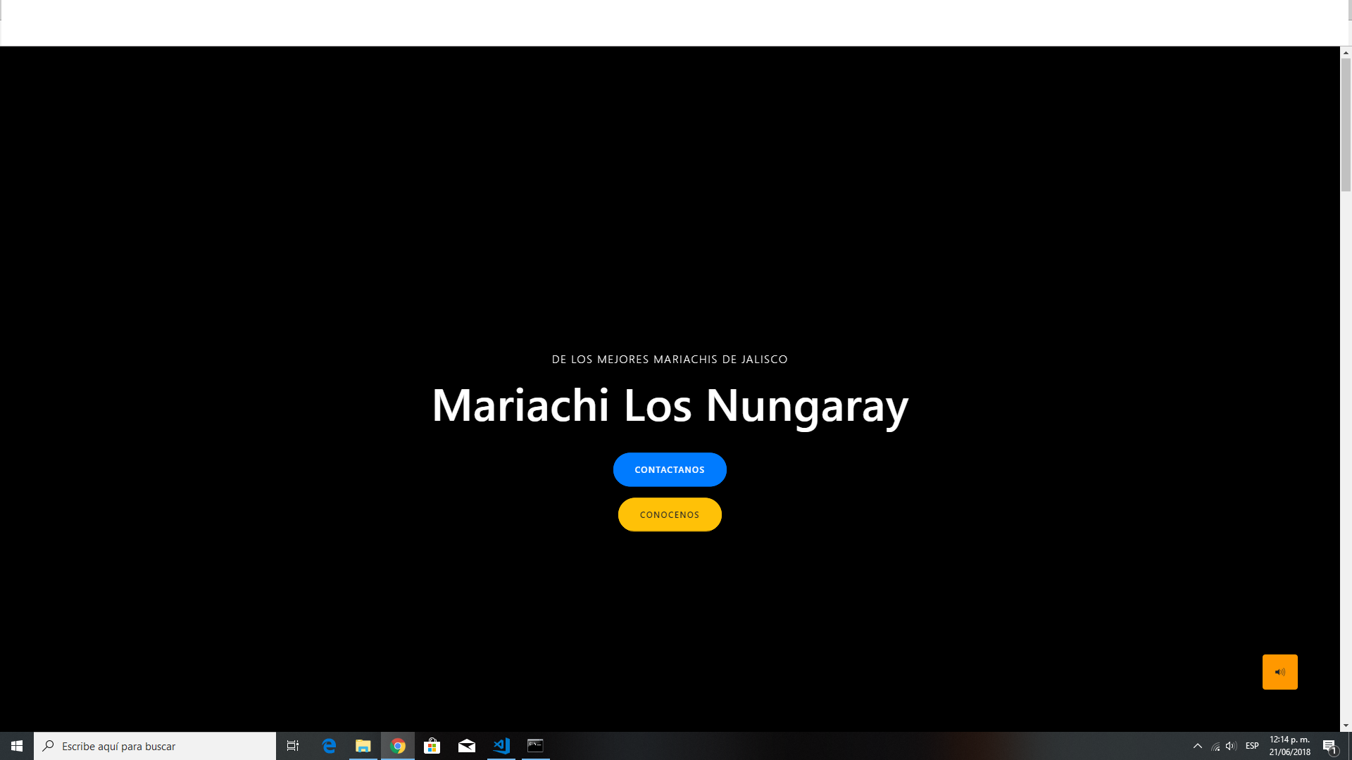
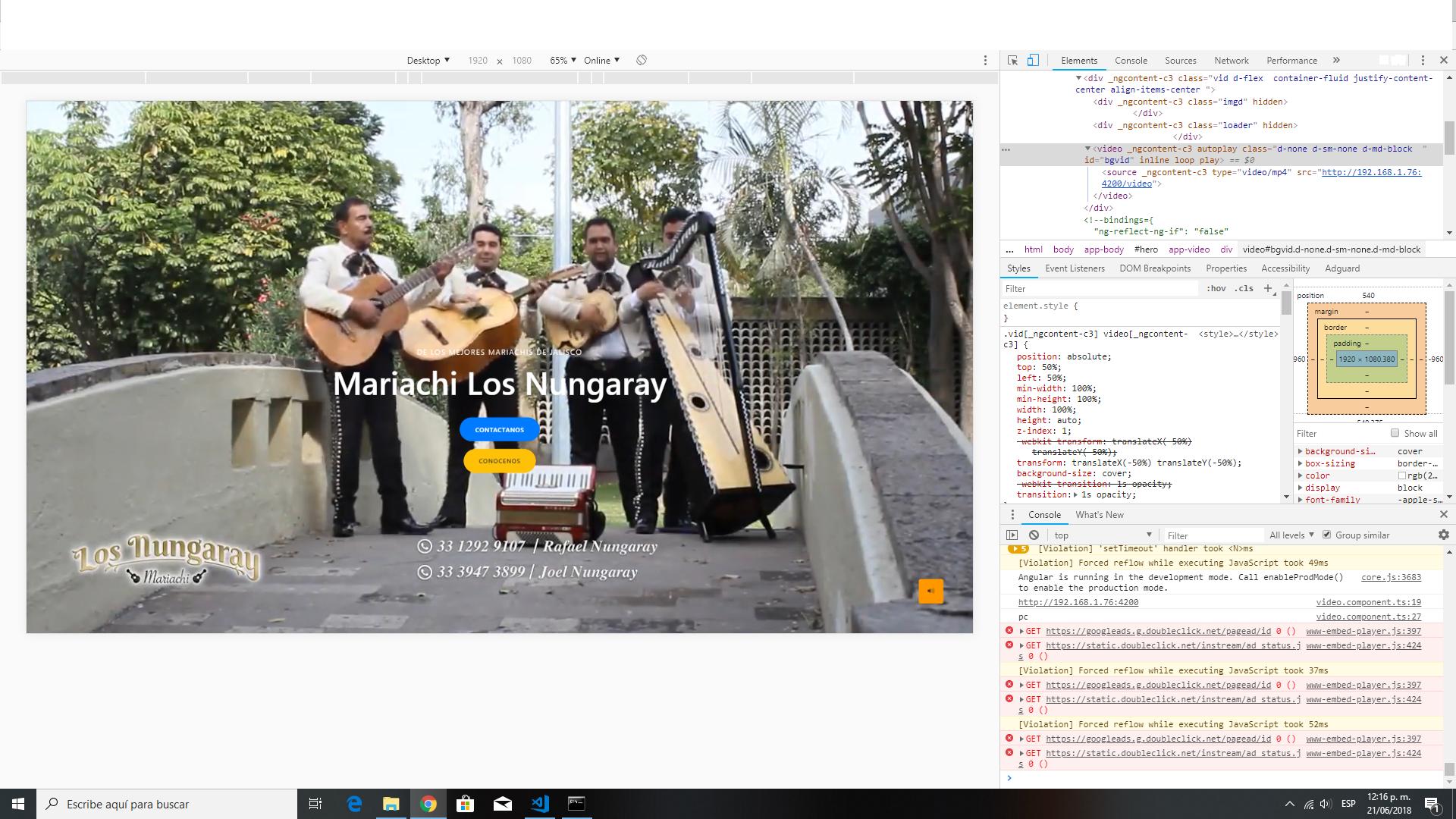
I am developing this page, but only when I open the console does the video play if I close the console it does not play anymore (when opening the console I keep the same screen size that I have in case someone asked)
import { Component, OnInit, EventEmitter,Input  } from '@angular/core';
import { HttpClient } from '@angular/common/http';
import { Observable } from 'rxjs/Observable';
import 'rxjs/add/observable/interval';
import 'rxjs/add/operator/takeWhile'

@Component({
  selector: 'app-video',
  templateUrl: './video.component.html',
  styleUrls: ['./video.component.css']
})
export class VideoComponent implements OnInit  {
  @Input() muted:boolean;
  mobile:boolean
  myVar:boolean = false;
  videos=''

  constructor(private httpClient:HttpClient) {
    console.log(window.location.origin)
    this.httpClient.get('/mobile',{responseType: 'json'})
    .subscribe(
      (data:any)=>{
        this.mobile=data.mobile
        if(data.mobile){
          this.videos=''
        }else{
          this.videos='${window.location.origin}/video'
        }
      }
    )


   }


  ngOnInit() {

    Observable.interval(1000)
    .takeWhile(() => this.myVar = true)
    .subscribe(i => {
        // This will be called every 10 seconds until 'stopCondition' flag is set to true
    })
  }


}
.slider{
height: 100vh;
background-size: cover;
background-position: center;
}
.vid {
width: 100%;
height: 100vh;
}
/* auto change 100%*/
.vid video {
position: absolute;
top: 50%;
left: 50%;
min-width: 100%;
min-height: 100%;
width: 100%;
height: auto;
z-index: 1;
transform: translateX(-50%) translateY(-50%);
background-size: cover;
transition: 1s opacity;
}
@media screen and (max-device-width: 800px) {
.slider {
background: url(https://scontent.fgdl5-1.fna.fbcdn.net/v/t1.0-9/25552067_552126321790932_1620459106336366433_n.jpg?oh=97214c3f3c4bdf35e8a738c1c3eec8c1&oe=5B1450F5);
height: 100vh;
background-size: cover;
background-position: center; }
.vid video{
display: inline;
position: static;
top: auto;
left: auto;
min-width: 0px;
min-height: 0px;
background-size: auto;
transition: 0s opacity;
}
.video{
display: none;
}
}
/*******************spiner*********************/
.loader {
border: 16px solid #f3f3f3; /* Light grey */
border-top: 16px solid #3498db; /* Blue */
border-radius: 50%;
width: 120px;
height: 120px;
z-index: 2;
animation: spin 2s linear infinite;
}
.imgd{
position: absolute;
top: 50%;
left: 50%;
min-width: 100%;
min-height: 100%;
width: 100%;
height: auto;
z-index: 2;
transform: translateX(-50%) translateY(-50%);
background-color: black;
background-size: cover;
transition: 1s opacity;
}
@keyframes spin {
0% { transform: rotate(0deg); }
100% { transform: rotate(360deg); }
} <div *ngIf="!mobile" class="vid d-flex container-fluid justify-content-center align-items-center ">
<div class="imgd" [hidden]="myVar">
</div>
<div class="loader" [hidden]="myVar">
</div>
<video #video [muted]="muted" play inline autoplay loop id="bgvid" class="d-none d-sm-none d-md-block ">
<source src="{{videos}}" type="video/mp4">
</video>
</div>
<div *ngIf="mobile" class="vid d-flex slider container-fluid justify-content-center align-items-center ">
<div class="imgd" [hidden]="myVar">
</div>
<div class="loader" [hidden]="myVar">
</div>
</div>