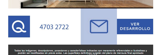
I'm putting together a responsive email template. When I see Desktop (max 600px) template has 1 or 2 columns, and seen in mobile parts 2 columns become 1. The problem is that in one of the columns I put 2 images of different proportions and me they are disproportionate. Attached photo:
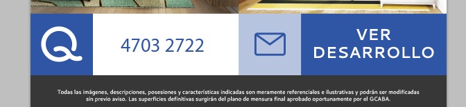
And it should be like this:
I have the online code here: coroleu.com/dev/email/email2.html
HTML
html,
        body {
	        margin: 0 auto !important;
            padding: 0 !important;
            height: 100% !important;
            width: 100% !important;
        }


        * {
            -ms-text-size-adjust: 100%;
            -webkit-text-size-adjust: 100%;
        }


        div[style*="margin: 16px 0"] {
            margin:0 !important;
        }


        table,
        td {
            mso-table-lspace: 0pt !important;
            mso-table-rspace: 0pt !important;
        }


        table {
            border-spacing: 0 !important;
            border-collapse: collapse !important;
            table-layout: fixed !important;
            margin: 0 auto !important;
        }
        table table table {
            table-layout: auto;
        }


        img {
            -ms-interpolation-mode:bicubic;
        }

        *[x-apple-data-detectors] {
            color: inherit !important;
            text-decoration: none !important;
        }


        .x-gmail-data-detectors,
        .x-gmail-data-detectors *,
        .aBn {
            border-bottom: 0 !important;
            cursor: default !important;
        }


        .a6S {
	        display: none !important;
	        opacity: 0.01 !important;
        }

        img.g-img + div {
	        display:none !important;
	   	}


        .button-link {
            text-decoration: none !important;
        }

        @media only screen and (min-device-width: 375px) and (max-device-width: 413px) { /* iPhone 6 and 6+ */
            .email-container {
                min-width: 375px !important;
            }
        }
                .button-td,
        .button-a {
            transition: all 100ms ease-in;
        }
        .button-td:hover,
        .button-a:hover {
            background: #555555 !important;
            border-color: #555555 !important;
        }

        @media screen and (max-width: 600px) {

            .email-container {
                width: 100% !important;
                margin: auto !important;
            }

            .fluid {
                max-width: 100% !important;
                height: auto !important;
                margin-left: auto !important;
                margin-right: auto !important;
            }

            .stack-column,
            .stack-column-center {
                display: block !important;
                width: 100% !important;
                max-width: 100% !important;
                direction: ltr !important;
            }

            .stack-column-center {
                text-align: center !important;
            }


            .center-on-narrow {
                text-align: center !important;
                display: block !important;
                margin-left: auto !important;
                margin-right: auto !important;
                float: none !important;
            }
            table.center-on-narrow {
                display: inline-block !important;
            }

			.email-container p {
				font-size: 17px !important;
				line-height: 22px !important;
			}

        }
<table role="presentation" aria-hidden="true" cellspacing="0" cellpadding="0" border="0" align="center" width="600" style="margin: auto;" class="email-container">
<tr>
<td bgcolor="#ffffff" class="stack-column-center">
<a href="tel:1147032722">
<img src="imagen-pie-izq.jpg" aria-hidden="true" width="600" height="" alt="alt_text" border="0" align="center" style="width: 100%; max-width: 600px; height: auto; background: #dddddd; font-family: sans-serif; font-size: 15px; line-height: 20px; color: #555555;" class="g-img">
</a>
</td>
<td bgcolor="#ffffff" class="stack-column-center">
<table role="presentation" aria-hidden="true" cellspacing="0" width="300" cellpadding="0" border="0" align="center" width="300" style="margin: auto;" class="email-container">
<tr>
<td bgcolor="#ffffff">
<a href="http://www.google.com">
<img src="imagen-email.jpg" aria-hidden="true" alt="alt_text" border="0" align="center" style="width: 100%; height: auto; background: #dddddd; font-family: sans-serif; font-size: 15px; line-height: 20px; color: #555555;" class="g-img">
</a>
</td>
<td bgcolor="#ffffff">
<a href="http://www.google.com">
<img src="imagen-pie-der.jpg" aria-hidden="true" alt="alt_text" border="0" align="center" style="width: 100%; height: auto; background: #dddddd; font-family: sans-serif; font-size: 15px; line-height: 20px; color: #555555;" class="g-img">
</a>
</td>
</tr>
</table>
</td>
</tr>
</table>The problem is only with that column. I understand that the media queries is set to different devices, but I need to know how I can distribute that column to adapt 2 images within that cell. Thanks.