Coordinate sidebar and browser bootstrap

0

Good!

First of all I am a supernoob with web pages and I have made the bad decision to use bootstrap in my first project of the university, so I would appreciate any advice you can give me: 3

I'm making a template of the navigation bar and the sidebar and I want them to be a bit coordinated.

First I created a row where the navigation bar is placed and I have divided it into two columns, one of size md-2 and another of md-10, in the small one I have put the header of the bar and in the big one the buttons.

For the rest of the page I have made another row and I have divided it in the same way as the previous one. In the small one the lateral bar is located and in the big one the main content of the pages.

By doing this, I have managed to make it appear that the two bars are joined in the header and gives it a rather aesthetic appearance in my opinion.

The problem is that I am correcting the position of some bootstrap elements by changing the margin and padding elements of some divs to get everything to fit as I want, but of course, according to the browser and screen size, the position I have set is not the same. and get out of shape.

How can I make some divs where I put buttons, content or whatever is always in the same position? (attached to a side or top). I have tried several ways that I have found on the internet but it always gets something out of place and it is a bit frustrating because I waste more time placing things than thinking and doing the page.

Here I leave the code: CodePen

I use bootstrap 3.3.7.

    
asked by Pablovg 03.04.2017 в 21:15
source

3 answers

0

You can use the following codes in css.

position: absolute;
z-index: 100;

One makes it absolute as it says, and regardless of what there is, it will always stay there. z-index defines in which "layer" is, that is, if you want it to be above 9999, if something is above it, that element must have a higher z-index.

I hope these codes and success will help you with your project: D

    
answered by 03.04.2017 / 21:24
source
0

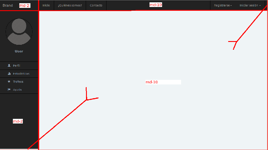
Friend remember that always the row of boostrap always have 12 cells ie. in a

<div class="row">

maximum of 12 cells if you want to have more than 12 create other rows. apart from that I recommend you read the documentation of boostrap.

link

Remember that also in a <div class="col-sm-12 col-md-12"> you can place the different differences of a screen.

in your code already modify it:

link

HTML

<head>
    <meta charset="utf-8" />
    <meta name="viewport" content="width=device-width, user-scalable=no, initial-scale=1.0">

    <!-- Latest compiled and minified CSS -->
    <link rel="stylesheet" href="https://maxcdn.bootstrapcdn.com/bootstrap/3.3.7/css/bootstrap.min.css">
    <!-- jQuery library -->
    <script src="https://ajax.googleapis.com/ajax/libs/jquery/3.2.0/jquery.min.js"></script>
    <!-- Latest compiled JavaScript -->
    <script src="https://maxcdn.bootstrapcdn.com/bootstrap/3.3.7/js/bootstrap.min.js"></script>

    <link href="general.css" type="text/css" rel="stylesheet" />
    <link href="inicio.css" type="text/css" rel="stylesheet" />
    <title>Inicio</title>
</head>

<body>

    <div class="container-full">

        <!-- Nav -->
        <nav class="navbar navbar-inverse navbar-static-top">
            <div class="container margin-left-nav">
                <div class="row">
                    <div class="col-md-2 col-sm-2">
                        <!-- Navbar brand (Brainiac) y botón colapsable -->
                        <div class="navbar-header">
                            <button class="navbar-toggle" type="button" data-toggle="collapse" data-target="#navbar-main">
                            <span class="icon-bar"></span>
                            <span class="icon-bar"></span>
                            <span class="icon-bar"></span>
                          </button>
                            <a class="navbar-brand" href="index.html">Brand</a>
                        </div>
                    </div>

                    <div class="col-md-10 col-sm-10">
                        <div class="navbar-collapse collapse" id="navbar-main">

                            <!-- Navbar botones -->
                            <ul class="nav navbar-nav horizontal mar-left">
                                <li><a href="inicio.html">Inicio</a></li>
                                <li><a href="miembros.html">¿Quiénes somos?</a></li>
                                <li><a href="contacto.html">Contacto</a></li>
                            </ul>

                            <!-- Navbar derecho (Registro, Login) -->
                            <ul class="nav navbar-nav navbar-right horizontal">

                                <!-- Registro -->
                                <li class="dropdown">
                                    <a href="#" class="dropdown-toggle" data-toggle="dropdown">Registrarse<span class="caret"></span></a>
                                    <ul class="dropdown-menu dropdown-width">
                                        <div class="col-lg-12">
                                            <div class="text-center">
                                                <h3><b>Registro</b></h3></div>
                                            <form>
                                                <div class="form-group">
                                                    <input type="text" class="form-control" placeholder="Usuario">
                                                </div>
                                                <div class="form-group">
                                                    <input type="email" class="form-control" placeholder="Email">
                                                </div>
                                                <div class="form-group">
                                                    <input type="password" class="form-control" placeholder="Contraseña">
                                                </div>
                                                <div class="form-group">
                                                    <input type="password" class="form-control" placeholder="Confirmar contraseña">
                                                </div>

                                                <!-- Botón Registrase -->
                                                <div class="form-group">
                                                    <div class="row">
                                                        <div class="col-xs-6 col-xs-offset-3">
                                                            <input type="submit" class="form-control btn btn-info" value="Registrarse">
                                                        </div>
                                                    </div>
                                                </div>
                                            </form>
                                        </div>
                                    </ul>
                                </li>

                                <!-- Inicio de sesión -->
                                <li class="dropdown">
                                    <a href="#" class="dropdown-toggle" data-toggle="dropdown">Iniciar sesión <span class="caret"></span></a>
                                    <ul class="dropdown-menu dropdown-width">
                                        <div class="col-lg-12">
                                            <div class="text-center">
                                                <h3><b>Inicio de sesión</b></h3></div>
                                            <form>
                                                <div class="form-group">
                                                    <label for="username">Usuario</label>
                                                    <input type="text" class="form-control">
                                                </div>
                                                <div class="form-group">
                                                    <label for="password">Contraseña</label>
                                                    <input type="password" class="form-control">
                                                </div>
                                                <div class="form-group">
                                                    <div class="row">
                                                        <div class="col-xs-7">
                                                            <input type="checkbox">
                                                            <label for="remember">Recordarme</label>
                                                        </div>
                                                        <div class="col-xs-5 pull-right">
                                                            <input type="submit" class="form-control btn btn-success" value="Log In">
                                                        </div>
                                                    </div>
                                                </div>
                                                <div class="row">
                                                <div class="form-group">
                                                    <div class="row">
                                                        <div class="col-lg-12">
                                                            <div class="text-center">
                                                                <a href="#" class="forgot-password">Olvidaste la contraseña?</a>
                                                            </div>
                                                        </div>
                                                    </div>
                                                </div>
                                                </div>
                                                <input type="hidden" class="hide" name="token" id="token" value="a465a2791ae0bae853cf4bf485dbe1b6">
                                            </form>
                                        </div>
                                    </ul>
                                </li>
                            </ul>
                        </div>
                    </div>


                </div>
            </div>
        </nav>
    </div>


    <section class="container-full">

        <!-- Main page -->
        <div class="row" id="full-page">

            <!-- Sidebar -->
            <div class="col-md-2 col-sm-2">
                <div class="profile-sidebar">

                    <!-- User picture -->
                    <div class="profile-userpic">
                        <img src="img/Otros/noUserPic.png" class="img-responsive img-circle border" alt="foto">
                    </div>

                    <!-- Sidebar title -->
                    <div class="profile-user">
                        <div class="profile-name">User</div>
                    </div>

                    <!-- Sidebar menu -->
                    <nav class="profile-menu">
                        <ul class="nav navbar vertical">
                            <li>
                                <a href="#"><i class="glyphicon glyphicon-user"></i> Perfil</a>
                            </li>
                            <li>
                                <a href="#"><i class="glyphicon glyphicon-stats"></i> Estadísticas</a>
                            </li>
                            <li>
                                <a href="#"><i class="glyphicon glyphicon-star"></i> Trofeos</a>
                            </li>
                            <li>
                                <a href="#"><i class="glyphicon glyphicon-flag"></i> Ayuda</a>
                            </li>
                        </ul>
                    </nav>
                </div>
            </div>

            <!-- Content -->
            <div class="col-md-10 col-sm-2">

            </div>
        </div>
    </section>
</body>

CSS

body {
    font-family: sans-serif;
    background-color: rgb(239, 244, 246);
}

.navbar {
    margin-bottom: 0 !important;
}

.mar-left {
    margin-left: -13px !important;
}

ul.navbar-right {
    /*margin-right: -15.45vw !important;*/
    margin-right: -8.5vw !important;
}

.navbar-nav>li>a {

}

.row {

}

.margin-left-nav {
    margin-left: 0 !important;
}

ul.dropdown-width {
    width: 300px;
}

.navbar .nav>li.dropdown.open.active>a:hover,
.navbar .nav>li.dropdown.open>a,
li a:hover,
li.active>a {
    color: #fff !important;
    background-color: rgb(10, 66, 117) !important;
}

li a:hover {
    background-color: rgb(10, 66, 117) !important;
    color: #ffffff !important;
}

li.active>a {
    background-color: rgb(10, 66, 117) !important;
    color: #ffffff !important;
}

.navbar-brand:hover {
    color: #5b9bd1 !important;
}

ul.horizontal li {
    border-left: 1px solid black;
}

ul.horizontal li:last-child {
    border-right: 1px solid black;
}


/*.center {
    margin: 0 auto !important;
}*/


/*.vertical-center {
    display: flex;
    align-items: center;
}*/

.border {
    border: 1px solid black;
}


/*----- Sidebar -----*/

.profile-sidebar {
    background-color: rgb(35, 35, 35);
    height: 92.5vh;
    border-right: 1px solid black;
    margin-top: 0 !important;
}

.profile-userpic {
    padding-top: 40px;
}

.profile-userpic img {
    margin: 0 auto;
    width: 70%;
    height: 70%;
}

.profile-user {
    text-align: center;
    margin-top: 20px;
}

.profile-name {
    color: #93a3b5;
    font-size: 16px;
    font-weight: 600;
    padding-bottom: 10px;
}

.profile-menu {
    margin-top: 30px;
}

.profile-menu ul li a {
    color: #93a3b5;
    font-size: 14px;
    font-weight: 400;
    padding-left: 40px;
    border-bottom: 1px solid black;
}

ul.vertical li:first-child {
    border-top: 1px solid black;
}

.profile-menu ul li a i {
    margin-right: 9px;
    font-size: 14px;
}


/*----- End Sidebar -----*/

#full-page {
    background-color: rgb(239, 244, 246);
    width: 100vw;
}

#header-content {
    height: 43.5vh;
}

.lma-content {
    height: 50vh;
}
    
answered by 03.04.2017 в 21:29
-1

Yes, I know what you have answered and I've tried several times, (As I'm still on the first go, I still do not have to adapt the page to mobile devices and so on) what I mean is that bootstrap has margin and padding by default in some of its elements, and I'm countered to place them right where I want.

The ideal solution for me would be to tell an element to the right of the whole regardless of padding and margin by default, but I can not get it to stay in place because I have to correct those fields constantly.

    
answered by 03.04.2017 в 21:36