This is the page synergytech.com.co I do not know why it does not fit properly on the screen of a cell phone, will the images be? I have declared on the scale:
<meta name="viewport" content="width=device-width, initial-scale=1.0">
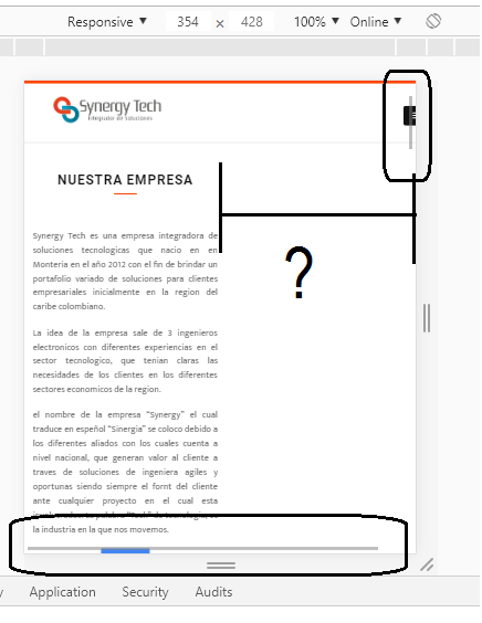
This is the page synergytech.com.co I do not know why it does not fit properly on the screen of a cell phone, will the images be? I have declared on the scale:
<meta name="viewport" content="width=device-width, initial-scale=1.0">
It seems to me that animations.css is causing the problem. Checking the animations I noticed that at some moments the div with animations appeared on the side which increased the width of the page. Specifically for the bounce classes, this rule is: transform: translateX(400px) .
If you delete animations.css you will see that the page takes the right size.