I am developing a small library / plugin in JavaScript that serves to highlight different parts of a page (with the intention of creating instructions or similar). But I'm encountering some problems, especially with Safari.
For the highlight use box-shadow because it has better compatibility than clip-path . I create an element with two shadows: an internal one (to give blur effect) and an external one (that will shade the entire page minus the centered object).
Here is a minimum, complete and verifiable example of the code I have:
#sp-frame {
  position: absolute;
  top: 0;
  right: 0;
  bottom: 0;
  left: 0;
}

#sp-focus {
  position: absolute;
  top: 50px;
  left: 100px;
  width: 80px;
  height: 50px;
  border-radius: 100%;
  box-shadow: inset 0 0 8px 0 rgba(0,0,0,0.8), 0 0 0 200vmax rgba(0,0,0,0.4);
}
<div id="sp-frame">
<div id="sp-focus">
</div>
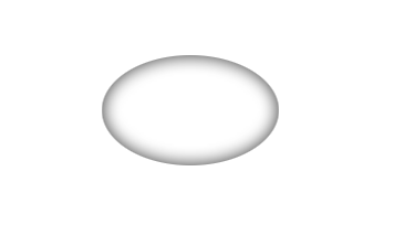
</div>The idea is to look like this:

But the problem is that in iPhone and Safari it looks like this:
I tried the proposed solutions in Compatibility problem with box-shadow , adding browser prefixes -webkit-box-shadow and -moz-box-shadow ... Without obtaining a positive result. I also tried -webkit-appearance as suggested in Appearance different from buttons in iOS safari . Also without obtaining the expected result.
For iPhone, I found a slightly odd solution: if instead of putting border-radius: 100% , I use border-radius: 99% , then the external shading looks good (as in the first image). But that does not work in Safari.
Initially I thought it was a problem with the unit vmax because if I put a value in px (eg 200px) it did look good. So I tried to calculate the screen width with JavaScript and assign that value * 2 in the shade ... But after doing some tests, I find that that does not work either.
Safari supports vmax in the shadow, the real problem is that if the generated value is greater than X (with X around the size of the screen approximately), that shadow is no longer visible. And that's a problem, because I need it to be larger than the screen size to make sure that there are no areas of the screen left without shading.
How can I solve this? Is there an alternative?