Hello Stackoverflow community!
As you can see in the image, the problem is why my 3D effect exceeds the z-index of the div that is closest to the user? This only happens to me in Safari, in the other browsers it works correctly.
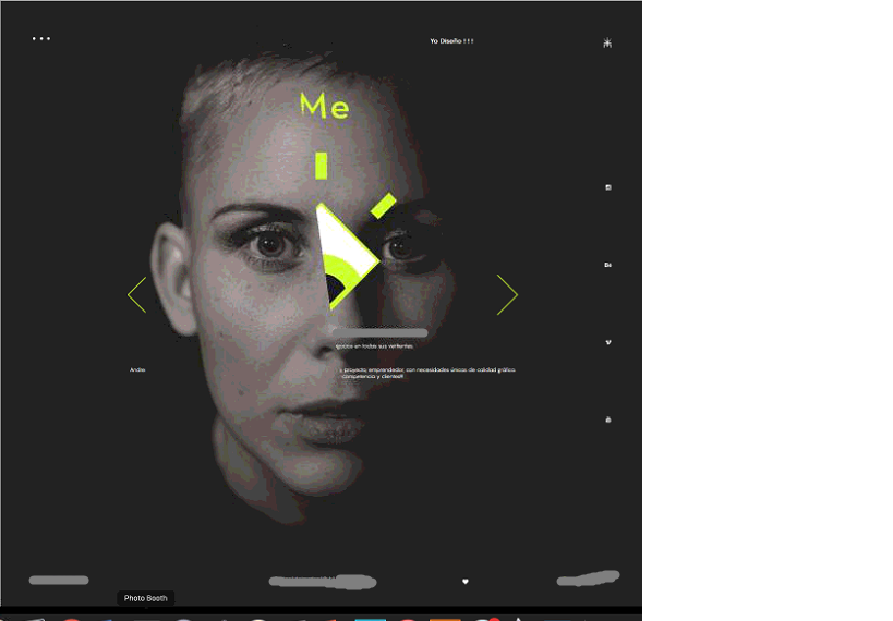
The div that contains the div of the background image, has as property: z-index: 49; position: absolute; and the div that looks trimmed has property: z-index: 50; position: absolute;
<div class="pieces" style="background-image: url("img/normal.jpg"); transition: transform 0.2s ease-out; transform: perspective(1000px) translate3d(2.05564px, 2px, 0px) rotate3d(1, 0, 0, 2deg) rotate3d(0, 1, 0, 1.02782deg);">
And this is what I apply to the div that contains the background image.