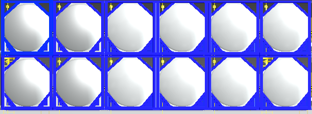
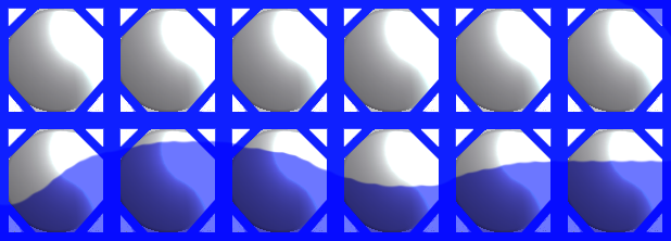
As you say it can be horizontal, you can use the pseudo-element :: before in the image container, place it below the image, position it below with a bottom: 0 and the height you parameterize using a Css-var, for example: - height-liquid: 20% and with javascript you change the variable in the online style of the parent element, the variable like this:
<div class="ancestro" style="--altura-liquido: 30%">
If you want you can give a small rotation to the element before as 2 degrees, to simulate that it is a liquid or using 2 pseudo elements to simulate a slightly more realistic wave, here I leave you a pen with an example:
Codepen: Simulation of liquids only css
*{
  box-sizing: border-box;
  padding: 0;
  margin: 0;
}

:root{
  /*¿Altura del liquido*/
  --liquid: 10%;
  /*Altura de la onda
  * Siendo 0.5 (cero) el minimo
  * y 0.99 (cero) el maximo*/
  --h-wave: 0.9;
  /*¿Color del borde?*/
  --cl-bd: blue;
  /*¿Color del liquido?*/
  --cl-lq: #6c77ff;
  /*¿Grosor del borde*/
  --bd: 0.4vw;
  /*¿Ancho del contenedor*/
  --w-cnt: 100vw;
  /*¿Cuantas cajas son?*/
  --n-box: 8;
  /*Ancho del contenedor menos el ancho de los bordes del contenedor*/
  --wlessbd: calc(var(--w-cnt) - ( (var(--bd) * 2) ) );
  /*¿Medida automatica de las cajas?*/
  --s-box: calc(  var(--wlessbd) / var(--n-box) );
}

.container {
  width: var(--w-cnt);
  margin: auto;
  border: solid var(--bd) var(--cl-bd);
  position: relative;
  overflow: hidden;
}

.row{
  display: flex;
  font-size: 0;
  letter-spacing: 0;
  position: relative;
  z-index: 2;
}

.box{
  box-shadow: inset 0 0 0 var(--bd) var(--cl-bd);
  display: inline-block;
  width: var(--s-box) ;
  height: var(--s-box) ;
  overflow: hidden;
  position: relative;
}

.box::before,
.box::after{
  content: '';
  top: 0;
  left: 0;
  display: inline-block;
  position: absolute;
}

/* para simular el hexagono*/
.box::before{
  width: 100% ;
  height: 100% ;
  --bd2: calc(var(--bd) * 2);
  box-shadow: inset 0 0 0 var(--bd2) var(--cl-bd);
  transform: rotateZ(45deg);
  z-index: 2;
}

.box::after{
  --sw1: calc(var(--s-box) / 8);
  --sw2: calc(var(--s-box) / -4);
  --sw3: calc(var(--s-box) / 3);
  --c-sw: rgba(0,0,0,.3);
  left: 3%;
  top: 3%;
  width: 94% ;
  height: 94% ;
  border-radius: 50%;
  box-shadow:
    inset 2px -2px 6px var(--c-sw),
    inset var(--sw1) var(--sw2) var(--sw3) var(--c-sw);
  z-index: 1;
}

.container::before,
.container::after{
  content: '';
  display: block;
  position: absolute;
  background-color: var(--cl-lq);
  height: var(--liquid);
  bottom: 0;
  left: 0;
}

.container::before{
  z-index: 2;
  width: 100%;
  transform-origin: 50% 100%;
  animation: wave-shrink 3s linear infinite;
}

.container::after{
  z-index: 1;
  width: 200%;
  border-radius: 50%;
  animation: wave-sway 5s linear infinite;
}

@keyframes wave-shrink{
  50%{ transform: scaleY(var(--h-wave));}
}

@keyframes wave-sway{
  0%{ transform: translateX(-100%);}
  100%{ transform: translateX(100%);}
}
<!--CAMBIA LA VARIABLE LIQUID Y VERÁS-->
<section class="container" style="--liquid: 95%;">
  <div class="row">
    <span class="box"></span>
    <span class="box"></span>
    <span class="box"></span>
    <span class="box"></span>
    <span class="box"></span>
    <span class="box"></span>
    <span class="box"></span>
    <span class="box"></span>
  </div>
  <div class="row">
    <span class="box"></span>
    <span class="box"></span>
    <span class="box"></span>
    <span class="box"></span>
    <span class="box"></span>
    <span class="box"></span>
    <span class="box"></span>
    <span class="box"></span>
  </div>
</section>
Now I can think of two variants from the above:
1) Instead of using a flat color for the liquid, use a gif for the background that simulates the ripple.
2) Another thing you can do is simulate water using canvas, like here: water canvas 1 codepen and here: water canvas 2 codepen or with a svg, but that if it exceeds my knowledge.
Update
Do not use the image of your example, because it turns out that your image is not transparent, as it is not, the waves will never be seen "behind", however, I give you an example of how you can control the variables using js, in this case jquery.
In the html, if you analyze it just delete the span and I did the same in the css, any class related to them (with the class "box") delete them.
Look at the comments in the css, I put the properties that make an element is on top of another, in this case is z-index: N; the higher the "N" number, the higher it will be.
Ah and add the property mix-blend-mode: mulitply, or fusion mode: multiply, that if you have experience using photoshop, what you do is transparent colors between lighter or saturated are, in the case of white what it becomes completely transparent, that's why I use it, but I do not recommend it, the best thing is that the image you use, either transparent so that you can see the waves of the water.
var $porcentaje = "60%" ;
var $colorFondo = "rgb(0,180,200)" ;

var $div = $(".container").css({
      "--liquid": $porcentaje,
      "--cl-lq": $colorFondo
    });
*{
  box-sizing: border-box;
  padding: 0;
  margin: 0;
}

:root{
  /*¿Altura del liquido*/
  --liquid: 10%;
  /*Altura de la onda
  * Siendo 0.5 (cero) el minimo
  * y 0.99 (cero) el maximo*/
  --h-wave: 0.9;
  /*¿Color del borde?*/
  --cl-bd: blue;
  /*¿Color del liquido?*/
  --cl-lq: #6c77ff;
  /*¿Grosor del borde*/
  --bd: 0.4vw;
  /*¿Ancho del contenedor*/
  --w-cnt: 100vw;
}

.container {
  width: var(--w-cnt);
  margin: auto;
  border: solid var(--bd) var(--cl-bd);
  position: relative;
  overflow: hidden;
}

.container img{
  position: relative;
  z-index: 2; /*para que la imagen este por encima*/
  display: block;
  width: 100%;
  height: auto;
  /*La imagen no es transparente,
  entonces aunque este adelante de la onda
  igual no se verá, por eso uso el modo
  de fusión "multiply", que hace que los colores
  entre más claros sean, más los transparenta*/
  mix-blend-mode: multiply;
  /*LO mejor es que la imagen tenga fondo
  transparente y quites esta propiedad*/
}

.row{
  display: flex;
  font-size: 0;
  letter-spacing: 0;
  position: relative;
  z-index: 2;
}


.container::before,
.container::after{
  content: '';
  display: block;
  position: absolute;
  background-color: var(--cl-lq);
  height: var(--liquid);
  bottom: 0;
  left: 0;
  z-index: 1; /*para que la onda este por debajo*/
}

.container::before{
  z-index: 2;
  width: 100%;
  transform-origin: 50% 100%;
  animation: wave-shrink 3s linear infinite;
}

.container::after{
  z-index: 1;
  width: 200%;
  border-radius: 50%;
  animation: wave-sway 5s linear infinite;
}

@keyframes wave-shrink{
  50%{ transform: scaleY(var(--h-wave));}
}

@keyframes wave-sway{
  0%{ transform: translateX(-100%);}
  100%{ transform: translateX(100%);}
}
<script src="https://cdnjs.cloudflare.com/ajax/libs/jquery/3.2.1/jquery.min.js"></script>


<section class="container">
    <img src="https://i.stack.imgur.com/co367.png"/>
</section>